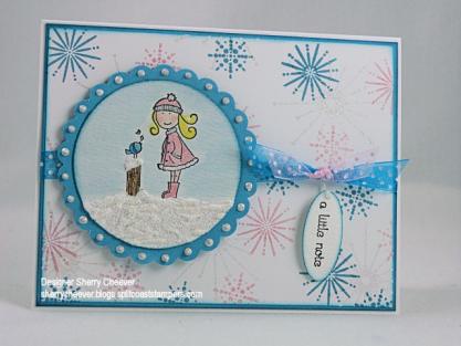
There’s been a challenge, a Dirty Challenge! Jami challenged the Dirty Dozen, current and alumni, to a challenge – upload a card using A Winter Song by Elzybells. We could use no patterned/designer paper (even though it might kill us in the process – she promised that if it didn’t, it would make us stronger) and to use the color, Pretty in Pink, somewhere in our design. For those of us who had not purchased the stamps, offers were made to get us images. I was lucky enough to be with Jeanne in Texas when her stamps arrived. I stamped some out before I left, so that I would have them when I got home.
The list of those Dirty Girls participating is amazing: Jami, SweetMissDaisy, kittie747, texasjdodylynn, Chantel, JanTInk, Lauraly, cookiestamper, waterchild12, StamperSharon, JulieHRR, genie1314, leigh obrien, Linda D, flaxychick, notimetostamp. 11Valerie11, mytime, rainy, debbiedesigns, Jeanne S, Duckwaddlequack, jbalcer, cwilliams, tayloredexpressions, LodiChick, atomicbutterfly, Zindorf, tashers, mel mel, WaterPixie, and rohla. Most of these girls have blogs and you will be able to find them in my blogroll. If they are not there, you can see them all on Splitcoaststampers. We’ve all used the keyword DCE1107 (Dirty Challenge Elzybells Nov ‘07).
What fun this card was to make. Some sponging, some glitter and bling, and stamping!
The image was stamped on watercolor paper and then colored with Adirondack reinkers. Crystal Stickles were applied to her coat and hat. The snow was made with Tulip White Puffy Paint and sprinkled with glitter while wet. The paint and glitter were allowed to dry until the very end of the card. I didn’t puff the paint until the card was completely finished so that I could manipulate the image and not flatten the poof! Liquid Pearls were applied to each scallop in the larger circle. The background panel was stamped using SU’s Snow Burst, and stamped in Pretty in Pink (there’s that pink) and Broken China Distress Ink. To add more bling to the background, the largest snowflake was stamped in Versamark and then embossed with Dazzling Diamond Dust. The edges of both the background panel and the main image were sponged with Broken China Distress Ink.
Stamps: SU Snow Burst, A Winter Song by Elzybell
Paper: Watercolor, Neenah Classic Crest Solar White, Tempting Turquoise
Ink: Pallet Noir Black, SU Pretty in Pink, Tim Holtz Broken China Distress Ink, Versamark
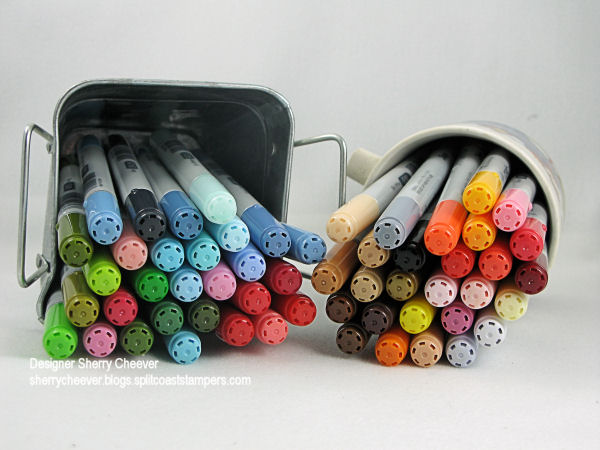
Accessories: Adirondack Reinkers, Watercolor Brushes, Tulip White Puffy Paint, Diamond Gold Ultra-Fine Glitter, Ranger Crystal Stickles and Liquid Pearls, Dazzling Diamond Dust EP, Ribbon, Heat Tool, Sponge Dauber
I hope everyone checks out all the other cards! WOW so much talent taking on a challenge!


