
This week has flown by so fast! I can’t believe that it’s time for another JBWW (Just Because We Wanna) Challenge. This week it’s Jeanne’s turn to pick the challenge, and she picked distressing. You can just imagine how happy I was with that one! Yep, I sure was! As with every JBWW Challenge, if you participate (which we hope you do), and post a card to your blog, please come back and link your card to either my blog or Jeanne’s, Inky Paws. If you upload to your Gallery on SCS, please use the keyword JBWW. If you’ve just stumbled across this challenge for the first time, please feel free to participate – the more the merrier!!! We love it when ya’ll play along with us.
I’ve had a number of requests about distressing, and how I get those curled edges, etc. Pamm (HRSECZY on SCS) emailed me last week about this very thing. So while I was making today’s JBWW card, it occurred to me that is was an excellent opportunity to talk distressing. I’ve made a separate Distressing Tutorial, and it is the post immediately following this one.
First, let’s talk about today’s JBWW card. I chose to work with a daisy image from the Bold Floral Collection from Rubbernecker Stamps today. I stamped in the image on watercolor paper then water colored using Ranger Tim Holtz Distress Inks. Once the image was dry, I trimmed it out from the paper and distressed the edges of the frame only. To add more depth to the image, I decided to sponge Vintage Photo Distress Ink along all the edges, dragging it across the front of the image. By dragging the ink across the panel, it highlighted the water coloring of the daisies. The two background panels started out as white cardstock that I sponged a combination of Worn Lipstick and Fired Brick Distress Inks on. For the background immediately behind the daisies, I used Tim Holtz Crackle Paint, tore the edges of the paper off and again sponged the edges. The bottom background panel has some added Fired Brick Paint and the edges were distressed with scissors and sponged. (More detail on all the distressing follows this post in the Distressing Tutorial).
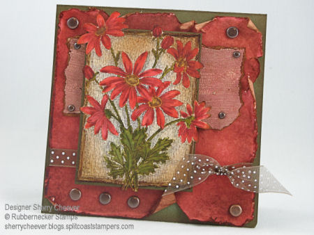
Stamps: Daisy by Rubbernecker Stamp Company
Paper: Watercolor, White and Green Cardstock
Ink: Frayed Burlap, Vintage Photo, Fired Brick, Tattered Rose, Peeled Paint, Scattered Straw, Worn Lipstick, Shabby Shutters Tim Holtz Distress ReInker; Fired Brick, Vintage Photo, Worn Lipstick and Weathered Wood Tim Holtz Distress Ink Pads
Accessories: Watercolor Brushes, Tsukineko Sponge Dauber, Brads, Ribbon, Mounting Tape, Scissors, Tim Holtz Scattered Straw Crackle Paint
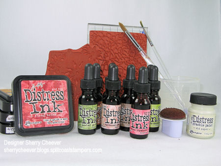
The following picture is of all the products I used to create this card, and can be found at Rubbernecker Stamp Company. I did make one mistake and included the crackle background that I decided not to use and did forget to include my ATG Gun. Sometimes ya win, sometimes ya don’t! One more thing, Rubbernecker is having their Winter Sale Event — check out all the great things on sale!


It’s yummy Sherry!!! I want my Crackle paint 🙂
This is so stunning! Thanks so much for sharing the details!
Wow…beautiful card and distressing!! Thanks for all the info! This is stunning!!
So very gorgeous. I love it.
I love your card, Sherry. Posted it on my blog and pointed out your wonderful tutorial. I can’t wait to get some Crackle Paint…but I did a fun version of distressing for the challenge today without it. I cheated and used wrapping paper images. But…it was fun.
awesomely gorgeous! love it,love it,love it!
Wow, your card is stunning Sherry! Absolutely gorgeous!
Wow! Exceptionally gorgeous card! Beautiful stamps and colors–love the names of those Tim Holtz inks. This is fabulous! I’ll be back to read your distressing tutorial. It looks very interesting! Thanks, Sherry!
here’s mine!
http://dawnanewday.blogspot.com/2007/12/jbww-distressed-rose.html
Here’s mine for the distressing challenge!! Usually I used browns but this time I stepped outside of my comfort zone and went a little lighter!! Thanks for the challenge!!
http://kraftinkimmieskorner.blogspot.com/2007/12/twinkle-brightly-shining-star.html
WOWEE!!! I LOVE your distressing!!! Gorgeous!!!
Here’s another one. It’s not the fancy schmancy REALLY dirty distressing, like you gals do with your Tim Holtz goodies, but sometimes a little can be just enough. Can’t tell you how much I appreciate your challenges and inspiration!! Have a wonderful holiday!!
http://kraftinkimmieskorner.blogspot.com/2007/12/you-better-watch-out.html
TOTALLY gorgeous distressing, Sherry!! Love the colors, composition–everything!
This card is absolutely GORGEOUS!!!
Ok, I know they are REAAAAALY late, but here is what I have been working on learning the dirty art of distressing!! The pics aren’t good cos I am scanner impaired and I don’t know enough to take pics with my digital camera! Here goes….http://www.splitcoaststampers.com/gallery/photo/771578?cat=500&ppuser=63686
http://www.splitcoaststampers.com/gallery/photo/771534?cat=500&ppuser=63686
http://www.splitcoaststampers.com/gallery/photo/771513?cat=500&ppuser=63686
http://www.splitcoaststampers.com/gallery/photo/771490?cat=500&ppuser=63686 This one looks much better IRL!!
Pamm
Hey Sherry! I FINALLY got around to using this stamp that I got at the show in Akron back in April! I don’t do it nearly the justice that you do, but it’s a beautiful stamp no matter what! http://www.stamphappy-tammy.typepad.com/
Sherry, if you have time, would you add me to your blogroll? I’d greatly appreciate it!
Absolutely gorgeous as usual
Jen