Good Sunday morning! It’s that time again, time for another Splitcoaststampers Dirty Dozen Challenge. This challenge is open to all current and alumni Dirty Dozen, and one that I enjoy participating in each month. This month the challenge was to make an Inspirational Journal using the following picture as inspiration.


Inspiration Photo


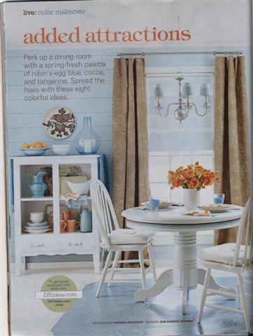
The inspirational photo is from BH&G 100 Decorating Ideas Under $100 magazine. We could choose to be inspired by the color pallette, the composition, or any other element of the photo that grabbed us. The restricted element for this challenge, was NO markers (including Copic, SU or any other brand) or watercolor crayons. I was immediately taken with the soft blue and white color scheme in the room. The next thing that jumped out at me were the flowers on the table and the oranges on the shelf. I decided to make my journal in blue and white, with just a small punch of orange.

DCI408

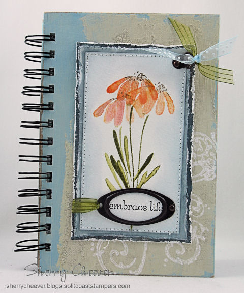
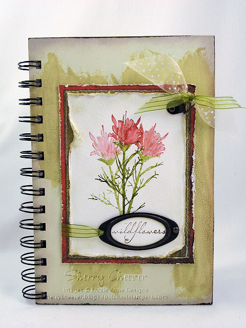
As you can see, I actually was inspired by one of my own creations as well. Yesterday I posted the journal that I made for the Lizzie Anne Designs April Project of the Month, which subsequently became my sister’s birthday present. This time, the journal is for me and the design on the POM Journal was one that I absolutely loved. Not only that, but since this journal is mine, I pulled out my favorite Penny Black floral stamp that I have not used in months and months and months. I won’t go into great detail in this post about making the journal (since I did that yesterday), but I will highlight some of the details.


I inked the flower image by tapping Distress Ink Pads directly onto the stamp. I then misted the image with water, and stamped it out three times on a piece of watercolor paper. Once the image was dry, I went back with a wet watercolor brush and pulled the ink into the open areas of the image. The edges of this panel were then sponged with Weathered Gray Distress Ink, completely into the image. Using a baby wipe, I then pulled some of the color off by wiping from the image out to the edges. I loved the effect I got, more of a watercolor look as opposed to sponging. The image was then layered onto solid colored designer paper and stitched together.


The covers for the journal were painted with acrylic paint, then highlighted with distress crackle paint. Once the crackle paint was dry, I went back and sanded all the edges to give the journal a worn look. As a last minute addition, I added the flourish to the all the covers and the inside pocket dividers. The flourish was stamped in white acrylic paint.

DCI408 INSIDE

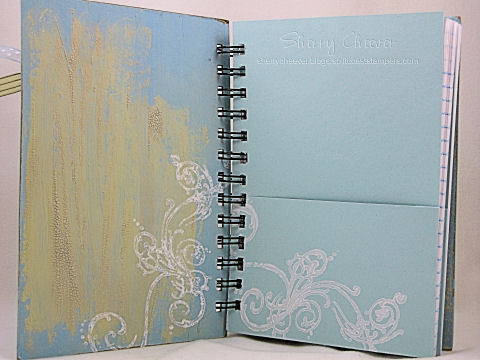
I decided to separate the journal in two sections, divided by pocket dividers. The first section contains lined paper, and the second section is plain white cardstock.

DCI408 PRODUCT


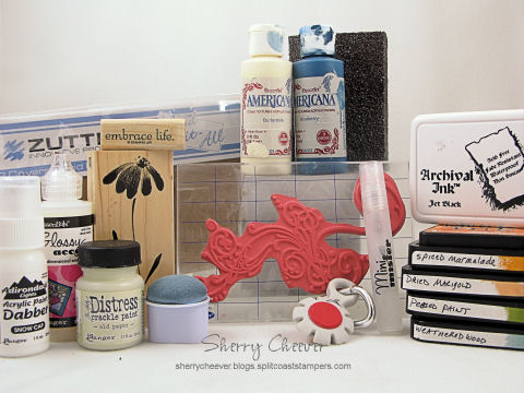
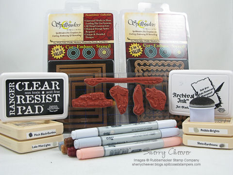
Stamps: Penny Black Blush; Stampers Anonymous Tim Holtz Collection Anthology from Rubbernecker Stamp Company; and Stampin’ UP! Embrace Life

Paper: Canson Watercolor Paper; BasicGrey Periphery; Stampin’ UP Bashful Blue; Georgia Pacific White; Lined Memo Pad

Ink: Ranger Archival Jet Black, Tim Holtz Spiced Marmalade, Dried Marigold, Peeled Paint, Weathered Wood and Vintage Photo Distress Inks

Accessories: DecoArt Americana Blueberry and Buttermilk Acrylic Paints; Ranger Glossy Accents, Mini Mister, Snow Cap Acrylic Paint Dabber, Tim Holtz Old Paper Distress Crackle Paint; Sewing Machine; Zutter Bind-it-All, 7.5×5″ Craft Covers, 1″ Double O Wire; SU Hodgepodge Hardware; Tonic Tim Holtz Distress Tool; Sanding Block; Ribbon; Watercolor Brush

I hope you enjoy the rest of your weekend, and that perhaps you are inspired to make your own journal. If you would like to see all the journals made by the Dirty Dozen, all you need to do is click on this keyword, DCI408.

NEW SIG

I hope everyone is enjoying their weekend so far. I meant to make this post earlier this morning, but I got a little sidetracked in the stamp room. I posted back on April 7 about my sister’s birthday. I hadn’t seen her then to give her the present I made, and didn’t want to spoil her surprise by posting it here until she had received it. Not only was this her birthday present, but it was also my Project of the Month for Lizzie Anne Designs. Now that it has been posted on the Lizzie Anne Designs website, and that my sister actually has it in hand, I can finally show you.

LAD POM Journal

I started with 7.5″x5″ Zutter Craft Covers. Both covers were painted front and back with Cermacoat Antique White Acrylic Paint. Once the covers had dried completely, the edges and some of the top finish were sanded with a coarse sanding block. The covers were then painted, inside and out, with Ranger Tim Holtz Scattered Straw Distress Crackle Paint and left to dry overnight. Taking a Shabby Shutters Distress Ink Pad directly to the covers, I wiped the pad across both covers, inside and out, working the distress ink into the cracks of the Crackle Paint. The acrylic paint acts as a resist to the distress ink, and where the finish was sanded lightly, the paint picked up a very light color of the distress ink. The edges of both covers were then sponged with Vintage Photo Distress Ink.


The inside pages of the journal are from a Top Flight 6″x9″ 120 Sheet Ruled Writing Tablet. The pages were trimmed down to 4-3/4″x7-1/4″ to fit inside the journal.


The image was inked with Peeled Paint and Fired Brick Distress Ink, misted with water, and then stamped three consecutive times on 120 lb. Canson Watercolor Paper. While the ink was still wet, a paint brush loaded with water, was used to blend the distress inks. Once the image was dry, the edges were distressed with scissors, and then sponged with Old Paper Distress Ink. The background panels are BasicGrey Infuse. The edges of the bottom panel were distressed with a distressing tool, and the edges were lightly sponged with Old Paper Distress Ink. The edges of the top background layer were sponged with Old Paper Distress Ink, and then both pieces of the designer paper were sewn together on the sewing machine. All three panels were then adjoined together.


The sentiment was stamped in Vintage Photo Distress Ink on Canson 120 lb. Watercolor Paper and punched out using a large oval punch. The edges of the sentiment were sponged with Old Paper Distress Ink, and then placed in the hardware. The hardware was attached to the image panel with a brad and the right and ribbon on the left, wrapped around the panel and taped to the back. An additional piece of hardware was attached to the top right corner and ribbon tied off in bows.


To assemble the journal, the covers and pages were punched with a Zutter Bind-it-All. Using a 3/4″ O wire, the journal was assembled in the appropriate order, and then fastened with the Bind-it-All. The image panel was then affixed to the front of the journal.


Stamps: In the Meadow by Lizzie Anne Designs

Paper: Canson 120 lb. Watercolor Paper; BasicGrey Infuse

Ink: Ranger Tim Holtz Shabby Shutters, Vintage Photo, Peeled Paint, Fired Brick and Old Paper Distress Inks

Accessories: Zutter Bind-it-All, 7.5″ x 5″ Craft Covers, and 3/4″ O Wire Binding; Sewing Machine; Tonic Scissors and Tim Holtz Distressing Tool; Tsukineko Sponge Dauber; Ranger Tim Holtz Scattered Straw Crackle Distress Pint; Cermacoat Antique White Acrylic Paint; Top Flight 6″ x 9″ Ruled Writing Tablet; Sanding Block; Hardware; Brads; Ribbon; Paint Brushes

I hope you enjoy the rest of your weekend, and I’m heading back to the stamp room. Too much to do and so little time!

NEW SIG

It is my pleasure to host the Limited Supply Challenge on Splitcoast today. Late last night, Jen called me and asked if I could fill in as hostess. Luckily I had been in the stamp room working on another Rubbernecker sample for the Akron Show, and could come up with something quick. Jen usually posts at night, and I didn’t want to keep the Challenge Chasers waiting.


After scanning through the weekly challenges, I realized that we had never done a Limited Supply Challenge for a tall and/or long card. This week’s challenge, LSC164 – Long Tall Sally, is to make a long and/or tall card measuring at least 4×8. This size card will fit in a standard letter/business size envelope. You should limit your layers and embellishments, and cannot use Designer Paper. (Okay, so I’m in a stampy mood tonight!)

LSC164

The images were stamped on white rectangles cut with Rectangle Nestabilities and then colored with Copic Markers. The edges were sponged with Adirondack Slate and then mounted on black Scalloped Rectangles, also cut with Nestabilities. The background panel was made by stamping the rod and reel in Ranger Clear Resist and then layers of different shades of gray inks were added with a sponge dauber.

LSC164 PRODUCT


Stamps: Rubbernecker Guy Stuff Collection Fishing Rod SKU:34-09, Fishing LureString Lure SKU:34-05, Striped Lure SKU:34-04 and Hook, Line & Sinker Text SKU:34-16 from Rubbernecker Stamp Company SKU:34-08,

Paper: Georgia Pacific White; Sterling Ultra Digital Imaging Matte; SU Basic Gray and Black

Ink: Ranger Clear Resist, Archival Jet Black, Adirondack Pitch Black, Pebble, Slate and Lake Mist

Accessories: Copic Markers; Spellbinders Rectangle Nestabilities; Tsukineko Sponge Dauber; Ribbons; Brads

I hope ya’ll have a great day today!

NEW SIG

Good Thursday afternoon! I’ve got to tell you, I took yesterday off! I didn’t crawl out of bed until 10:30 and then just putzed around the house all day. I read three days worth of papers, walked the dogs and enjoyed the sunshine, and than finally last night – I did my most hated chore — I paid the household bills! At least that is done for mid-month and that monkey is not crawling on my back for the next two weeks. You’ve got to love the weather we are having here! For me, it’s short weather – 70 degrees and sunny!


Since I didn’t stamp yesterday at all (heck, I never even walked downstairs), I am in the mood today. I started working on this card a few nights ago and when I saw the SCS Ways to Use It Challenge today, I modified it just a bit. Now that I’m done with it, I realize that it could actually be used for a Father’s Day, birthday or even a thank you card for that special guy! I’m actually glad that I did change this card up from the first layout – I like it more this way!

WT162

The tie was stamped on a piece of BasicGrey Archaic, cut out and placed on a layer of white. It doesn’t really qualify as paper piecing, but it’s the same general idea. I sponged the edges of this panel and the sentiment panel with Adirondack Cloudy Blue ink. The background papers are also from Archaic. To comply with the challenge today, I stamped the background stripes by painting directly on my stamp with a Ranger Snow Cap Acrylic Paint Dabber. I love the mottled and different look that the acrylic paint gives you when you stamp with it. I distressed the bottom edges of the middle panel with my trusty scissors, and when I added the twill, it reminded me of a belt. How cool is that!

WT162 PRODUCT


Stamps: Rubbernecker Guy Stuff Collection Tie SKU:30-01, Striped Background and One in a Million Sentiment from Rubbernecker Stamp Company

Paper: Georgia Pacific White; Prism Mystic Light and Herbal Garden Dark; BasicGrey Archaic

Ink: Ranger Adirondack Cloudy Blue and Archival Jet Black

Accessories: Ranger Snow Cap Acrylic Paint Dabber; Tonic Tim Holtz Scissors (for distressing); Brads, Photo Tag and Ribbon Slide Hardware; Mounting Tape; Twill Tape; Tsukineko Sponge Dauber

I hope everyone has a great day, and you get to enjoy some sunshine in your neck of the woods. I’m gonna take the dogs for another walk and then head back to the stamp room!

NEW SIG

Well, it’s Tuesday and you know what that means. It’s Treasure Hunt Tuesday at Rubbernecker! If you follow the clues and find the hidden treasure, you will receive it free, if you make a purchase. You can find the first clue in the Treasure Hunt on Broni’s blog today. Two of our Design Team Members, Jeanne and Linda, have Rubbernecker Blog Candy today. You’ll want to be sure to visit their blogs for a chance to win. While you are visiting Rubbernecker, don’t forget to check out the home page for info on how you can earn free stamps and shipping.


The card I have to show you today is the first in a series of five. They are fun little cards that make me giggle. I hope they do the same for you!

Bayo

This is Bayo, who was colored with Copic Markers, trimmed down to 1” square, and then mounted on a heavy weight chipboard coaster. The coaster square was covered with Black Glossy Cardstock. Image background panels were made with Nestabilities.


Stamps: KK Originals Out of Africa Collection Bayo and Backgrounds Collection Spiral Background 59‑04 KK from Rubbernecker Stamp Company

Paper: Georgia Pacific White, Black Glossy

Ink: Ranger Adirondack Pitch Black

Accessories: Copic Markers, Heavy Weight Chipboard Coaster, Ribbon, Spellbinders Nestabilities

Since there are five of these, I decided to show you a second one today – Sanyu.

Sanyu

Sanyu was colored with Copic Markers, trimmed down to 1” square, and then mounted on a heavy weight chipboard coaster. The coaster square was covered with Black Glossy Cardstock. Image background panels were made with Nestabilities.


Stamps: KK Originals Out of Africa Collection Sanyu and Backgrounds Collection Spiral Background 59‑04 KK from Rubbernecker Stamp Company

Paper: Georgia Pacific White, Black Glossy

Ink: Ranger Adirondack Pitch Black

Accessories: Copic Markers, Heavy Weight Chipboard Coaster, Ribbon, Spellbinders Nestabilities

Here’s hoping each of you have a great day today and stay out of trouble! Hmmm, if you can’t stay out of trouble, at least I hope you aren’t too BAD!

NEW SIG

© 2015 Suffusion theme by Sayontan Sinha