Good morning!  Smiley from millan.net This was going to be the day that I would being the videos.  What I’m thinking is actually babbling in a video.  Then I will have my card and the necessary deets.  That way for people who truly aren’t interested they can skip the video.  This has been in the works for a month or so now but I have yet to get it done.  I didn’t write about this project last night when I finished, well because  . . . I wanted to do the video.  Alas, I got out of bed this morning with a headache and today is probably not the day to start.  I did promise a reader however, that I would do a video tutorial on the fragment tag I used on my Wacky Wednesday card.  It will be coming real soon!

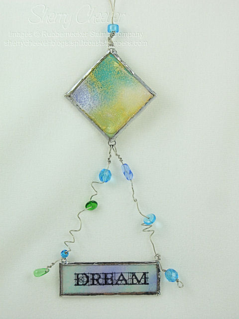
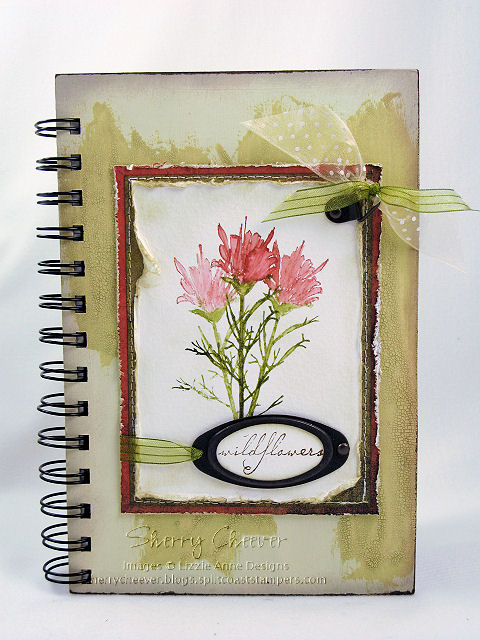
A number of months ago, I truly can’t remember how long . . . maybe 4 or 5, I was at Target shopping.  I found in the Dollar Spot a package of 3 unfinished wood frames that some how jumped into my cart.  I had an idea of what I wanted to do with them, but unfortunately time has not been on my side.

You know that project I was talking about yesterday?  The one I had to let dry, blah blah blah?  Well, it is one of these frames.  It’s funny how I was working on a frame and then yesterday’s Splitcoast Ways to Use It Challenge was for frames.  Smiley from millan.net I just had to finish the frame last night.

The frame is fairly close to what I had imagined.  This one is a practice piece, as I have an idea for my mother and her colors are definitely NOT green, orange and blue.  This one will hang in my studio which does have blue and green accents.  Now that I have general premise down, I can move on to the one for my mother.

WT214Hope

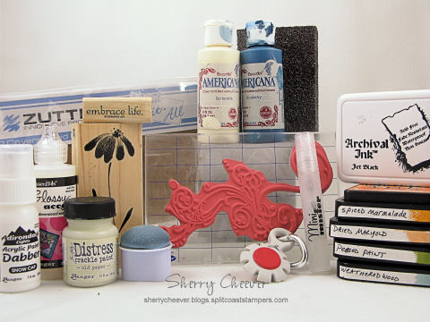
The unfinished frame was painted with acrylic paint and once that was dry, a layer of Distress Crackle Paint was applied over the acrylic paint.  After the Crackle Paint had dried, the edges and various places on the frame were sanded to appear worm and handled.  The flower embellishment is made with Grunge Paper.  The leaves were stamped, inked and then cut out.  The layers for the flower were die cut with Spellbinders Daisy Heads Shapeabilities, inked and then over stamped with Rubbernecker’s Loose Weave Background.  For the panel inside the frame, that “Inky Thing I Do” was done with Antique Linen, Spiced Marmalade and Broken China.  Those colors were used because the flowers were inked with Spiced Marmalade and Broken China.  The sentiment was stamped in Ranger Archival Coffee.

If the photo looks funny, I took the picture with the frame upside down (didn’t want to mess up those grunge paper leaves and flower) and then rotated it in Paint Shop.

I hope each of you have a great day and thanks for stopping by!

I must leave you with this:  Smiley from millan.net I just saw it and it made me giggle. I just can’t help myself some times!

Good morning and Happy Wednesday!  Smiley from millan.net Can you believe that it’s Wednesday already?  I know I can’t, but then again, I’m still chasing myself around the house! Smiley from millan.net

Today is the Rubbernecker Blog Challenge.  You can find more deets on the Rubbernecker Stamps Blog.  The challenge this week is to use Grunge Board or Chip Board.  I chose to work with Grunge Board and had a great time getting my fingers all inky!  Actually, this isn’t even a card, but a 5.5 x 5.5 panel that I’m hoping to find a frame for.  Better yet, it may become the focal point on another project.  Who knows where this will end up!  All of a sudden I can see a large canvas with many different project boards on it – .

Grunge Heart Panel

The heart was inked with Fired Brick and then highlighted with Aged Mahogany.  The keyhole and key were first painted with Scattered Straw Distress Crackle Paint and then when it was dry, inked with Peeled Paint.  To add more dimension to these pieces, they were lightly dabbed with a Gold Paint Dabber and then highlighted with Vintage Photo.

The background paper is a 5.5 x 5.5 piece of Very Vanilla that was distressed by adding layers of color and drying in between each layer with an iron.  There is a light spray of Vintage Photo/Pearl Pearlized Distress Mist that was diluted with more water and ironed to dry.  I wanted this background to look like an old piece of paper that had been folded and refolded for years.  The ribbon was melted with a candle lighter.  The final project is mounted on a 5.5 x 5.5 square of cardboard.

  • Stamps: Stamp Oasis Sentiment Collection: Adventure Text SKU:167 SO from Rubbernecker Stamp Company
  • Paper: SU Very Vanilla; Cardboard
  • Ink: Ranger Archival Jet Black; Vintage Photo, Antique Linen, Peeled Paint, Aged Mahogany, Fired Brick, and Old Paper Distress
  • Accessories: Tim Holtz idea-ology Grunge Board Elements, Philosophy Tag, Jump Ring and Trinket Pin; Ranger Inkssential Ink Blending Tool, Mini Mister, Scattered Straw Distress Crackle Paint, Gold Paint Dabber, Pearl Perfect Pearls; Venture Foam Tape; Tonic Tim Holtz Distress Tool; Iron; Ribbon; Candle Lighter

Here’s hoping you have a great day today and that you come play along with the challenge.

Avast ye mateys! It be Tuesday, Smiley from millan.net Treasure Hunt Tuesday at Rubbernecker! You can find today’s clue and all the necessary deets on the Rubbernecker Home Page. While you’re there, take note that this week’s Sale Product is the Mini Scor-it. The Colorbox Fluid Chalk Pads are on sale for one more week too.

Don’t forget to visit the blogs of the Design Team Members to see what they have for you today.

Bev – Savor the Journey


Broni – Splashes of Watercolor (Blog Candy)


Candy – Candys Land


Jules – Stampin with Inky Fingers


Kittie – Kittie Kraft


Linda – Linda’s Works of Heart (Blog Candy)


Shelly – Stamp with Shelly


Tami – A Walk on the Mild Side

As you know, I’ve become addicted to soldering. Well . . . over the weekend I was working on a project using chalk inks. When it was complete, I kept looking at it thinking okay, I can solder this and it can become

Faux Sea Glass Sun Catcher Door

A Sun Catcher!

A few days ago, I was browsing some of my favorite blogs and sites, and ran across this video tutorial by Suze Weinberg for Faux Sea Glass. I just HAD to try it. The top piece of the sun catchers is a 2″ square of Frosted Memory Glass. Instead of using pigment inks that Suze did in her tutorial, I used chalk inks. Actually I made two, one with chalk inks and one with pigment inks. I like the one with the chalk inks better, and the technique works just as well as with the pigments that Suze demonstrates. I’m not going to go into detail here. It’s all on Suze’s video. If you don’t see it right away, click one of the videos and then stop it. A panel will come up across the bottom of the screen and you can search for Faux Sea Glass.

The bottom panel is a piece of 1×3 Memory Glass that I inked the back with chalk inks and then embossed with two coats of clear UTEE. The sentiment was stamped on the front of the glass in Archival Jet Black Ink. To finish off the sun catcher, I added some wire and beads so that the sentiment panel would hang below the diamond. The hanger is double wire looped at the top so that I can hang it in my kitchen window (when it’s clean). By the way, when you solder the Faux Sea Glass, the UTEE on the front will melt, so be careful. I actually thought that the melting gave the glass a more distressed look and LOVED it!

I had a heck of a time getting decent pictures, but here is one of the sun catcher showing the actual colors of the glass.


Faux Sea Glass Sun Catcher

  • Stamps: Stamp Oasis Face ATC Set from Rubbernecker Stamp Company
  • Ink: Pink Pastel, Lavender, Aquamarine and Ice Jade Colorbox Fluid Chalk, Ranger Archival Jet Black
  • Accessories: Ranger Perfect Medium, UTEE, Gold and Pearl Perfect Pearls, 2″ Square Frosted Memory Glass, 1×3″ Memory Glass; Soldering Tool and Solder; Wire; Beads; Copper Foil Tape; Jump Rings

I hope you’ll be back tomorrow, when I post the first Twisted and Demented Challenge. I am sooooooooo excited!!!! Hints: socks, swingin’ and now tails!

Have a great day!

Good Sunday morning! It’s that time again, time for another Splitcoaststampers Dirty Dozen Challenge. This challenge is open to all current and alumni Dirty Dozen, and one that I enjoy participating in each month. This month the challenge was to make an Inspirational Journal using the following picture as inspiration.


Inspiration Photo


The inspirational photo is from BH&G 100 Decorating Ideas Under $100 magazine. We could choose to be inspired by the color pallette, the composition, or any other element of the photo that grabbed us. The restricted element for this challenge, was NO markers (including Copic, SU or any other brand) or watercolor crayons. I was immediately taken with the soft blue and white color scheme in the room. The next thing that jumped out at me were the flowers on the table and the oranges on the shelf. I decided to make my journal in blue and white, with just a small punch of orange.

DCI408

As you can see, I actually was inspired by one of my own creations as well. Yesterday I posted the journal that I made for the Lizzie Anne Designs April Project of the Month, which subsequently became my sister’s birthday present. This time, the journal is for me and the design on the POM Journal was one that I absolutely loved. Not only that, but since this journal is mine, I pulled out my favorite Penny Black floral stamp that I have not used in months and months and months. I won’t go into great detail in this post about making the journal (since I did that yesterday), but I will highlight some of the details.


I inked the flower image by tapping Distress Ink Pads directly onto the stamp. I then misted the image with water, and stamped it out three times on a piece of watercolor paper. Once the image was dry, I went back with a wet watercolor brush and pulled the ink into the open areas of the image. The edges of this panel were then sponged with Weathered Gray Distress Ink, completely into the image. Using a baby wipe, I then pulled some of the color off by wiping from the image out to the edges. I loved the effect I got, more of a watercolor look as opposed to sponging. The image was then layered onto solid colored designer paper and stitched together.


The covers for the journal were painted with acrylic paint, then highlighted with distress crackle paint. Once the crackle paint was dry, I went back and sanded all the edges to give the journal a worn look. As a last minute addition, I added the flourish to the all the covers and the inside pocket dividers. The flourish was stamped in white acrylic paint.

DCI408 INSIDE

I decided to separate the journal in two sections, divided by pocket dividers. The first section contains lined paper, and the second section is plain white cardstock.

DCI408 PRODUCT


Stamps: Penny Black Blush; Stampers Anonymous Tim Holtz Collection Anthology from Rubbernecker Stamp Company; and Stampin’ UP! Embrace Life

Paper: Canson Watercolor Paper; BasicGrey Periphery; Stampin’ UP Bashful Blue; Georgia Pacific White; Lined Memo Pad

Ink: Ranger Archival Jet Black, Tim Holtz Spiced Marmalade, Dried Marigold, Peeled Paint, Weathered Wood and Vintage Photo Distress Inks

Accessories: DecoArt Americana Blueberry and Buttermilk Acrylic Paints; Ranger Glossy Accents, Mini Mister, Snow Cap Acrylic Paint Dabber, Tim Holtz Old Paper Distress Crackle Paint; Sewing Machine; Zutter Bind-it-All, 7.5×5″ Craft Covers, 1″ Double O Wire; SU Hodgepodge Hardware; Tonic Tim Holtz Distress Tool; Sanding Block; Ribbon; Watercolor Brush

I hope you enjoy the rest of your weekend, and that perhaps you are inspired to make your own journal. If you would like to see all the journals made by the Dirty Dozen, all you need to do is click on this keyword, DCI408.

NEW SIG

I hope everyone is enjoying their weekend so far. I meant to make this post earlier this morning, but I got a little sidetracked in the stamp room. I posted back on April 7 about my sister’s birthday. I hadn’t seen her then to give her the present I made, and didn’t want to spoil her surprise by posting it here until she had received it. Not only was this her birthday present, but it was also my Project of the Month for Lizzie Anne Designs. Now that it has been posted on the Lizzie Anne Designs website, and that my sister actually has it in hand, I can finally show you.

LAD POM Journal

I started with 7.5″x5″ Zutter Craft Covers. Both covers were painted front and back with Cermacoat Antique White Acrylic Paint. Once the covers had dried completely, the edges and some of the top finish were sanded with a coarse sanding block. The covers were then painted, inside and out, with Ranger Tim Holtz Scattered Straw Distress Crackle Paint and left to dry overnight. Taking a Shabby Shutters Distress Ink Pad directly to the covers, I wiped the pad across both covers, inside and out, working the distress ink into the cracks of the Crackle Paint. The acrylic paint acts as a resist to the distress ink, and where the finish was sanded lightly, the paint picked up a very light color of the distress ink. The edges of both covers were then sponged with Vintage Photo Distress Ink.


The inside pages of the journal are from a Top Flight 6″x9″ 120 Sheet Ruled Writing Tablet. The pages were trimmed down to 4-3/4″x7-1/4″ to fit inside the journal.


The image was inked with Peeled Paint and Fired Brick Distress Ink, misted with water, and then stamped three consecutive times on 120 lb. Canson Watercolor Paper. While the ink was still wet, a paint brush loaded with water, was used to blend the distress inks. Once the image was dry, the edges were distressed with scissors, and then sponged with Old Paper Distress Ink. The background panels are BasicGrey Infuse. The edges of the bottom panel were distressed with a distressing tool, and the edges were lightly sponged with Old Paper Distress Ink. The edges of the top background layer were sponged with Old Paper Distress Ink, and then both pieces of the designer paper were sewn together on the sewing machine. All three panels were then adjoined together.


The sentiment was stamped in Vintage Photo Distress Ink on Canson 120 lb. Watercolor Paper and punched out using a large oval punch. The edges of the sentiment were sponged with Old Paper Distress Ink, and then placed in the hardware. The hardware was attached to the image panel with a brad and the right and ribbon on the left, wrapped around the panel and taped to the back. An additional piece of hardware was attached to the top right corner and ribbon tied off in bows.


To assemble the journal, the covers and pages were punched with a Zutter Bind-it-All. Using a 3/4″ O wire, the journal was assembled in the appropriate order, and then fastened with the Bind-it-All. The image panel was then affixed to the front of the journal.


Stamps: In the Meadow by Lizzie Anne Designs

Paper: Canson 120 lb. Watercolor Paper; BasicGrey Infuse

Ink: Ranger Tim Holtz Shabby Shutters, Vintage Photo, Peeled Paint, Fired Brick and Old Paper Distress Inks

Accessories: Zutter Bind-it-All, 7.5″ x 5″ Craft Covers, and 3/4″ O Wire Binding; Sewing Machine; Tonic Scissors and Tim Holtz Distressing Tool; Tsukineko Sponge Dauber; Ranger Tim Holtz Scattered Straw Crackle Distress Pint; Cermacoat Antique White Acrylic Paint; Top Flight 6″ x 9″ Ruled Writing Tablet; Sanding Block; Hardware; Brads; Ribbon; Paint Brushes

I hope you enjoy the rest of your weekend, and I’m heading back to the stamp room. Too much to do and so little time!

NEW SIG

© 2015 Suffusion theme by Sayontan Sinha