Ahoy ye mateys! It’s TREASURE HUNT TUESDAY @ RUBBERNECKER. The Treasure if you find it, will be a free image. However, to receive the Treasure a purchase of any size is required, and your treasure must be claimed between 4:00 am PST until 9:00 pm PST today (7:00 am EST – 12:00 am EST). Not only is today Treasure Hunt Day, but for every $50 in stamps purchased, you will receive one FREE stamp, and don’t forget about the Rubbernecker Bucks Drawing. You can check out more information on the Rubbernecker Home Page.

There are five opportunities today to win some Rubbernecker Bucks. You definitely want to check out:

Candy Williams – Candy’s Land

Kittie Kraft – Kittie Caracciolo

Splashes of Watercolor – Broni Holcombe

Stamp Owl – Frances Byrne

Stamp Talk with Tosh – Tosha Leyendekker

Your first Treasure Hunt Clue today can be found on Frances’ blog. Check it out, I surely don’t want to make you I’d rather give you a

While visiting the Tim Holtz Idea-ology booth at CHA, I took a few pictures of items that struck my fancy. As I was going through my photos and moving some things around, one card in particular caught my eye.

ER Inspiration Card

Using this card as inspiration, and having some extra time, I decided to create. While working on my card, I decided midway through that it would be a perfect opportunity to walk you through the Embossing Resist Technique. I know there are many tutorials on this technique, and I don’t really remember where I first saw it. It very well could have been a challenge on Splitcoast. Beate has written a wonderful tutorial for Splitcoast and after reviewing it, I realize that I have thrown in a little twist, so I will go ahead and show you.

Before I show you my card, there is a story I would like to tell about the image I have used. When my girls were small, they often awoke during the night from bad dreams. I myself had the occasional nightmare, albeit probably not as scary as those of a small child. One day while discussing the sleepless nights with a fellow Girl Scout Leader, she suggested a dream catcher. I was somewhat familiar with them, having seen them in shops and at craft fairs, but never fully understood the reasoning for them. I did a little research, and this is what I found:

Dream Catchers are an ancient spiritual tool used to help assure good dreams to those that sleep under them. A dream catcher is usually placed over a place you would sleep where the morning light can hit it. As you sleep all dreams from the spirit world have to pass through the dream catcher. Only good dreams can pass through the hole in the center while the bad dreams are caught in the webbing and are destroyed by the morning light.

In an attempt to keep my girls from having nightmares, a dream catcher was hung over their beds as well as mine. Mallory was actually the recipient of a very special Dream Catcher made by a Native American that we had met at a craft fair. It still hangs in her bedroom. The Dream Catchers helped both my girls and I can’t remember getting up with them during the night because of nightmares after they were placed above their beds. As for me, I can honestly say that I have not had a nightmare and/or bad dream since placing my Dream Catcher in my room. I’ve never removed the one from my room and it has hung there for close to 15 years now. I forget it’s there most of the time and only notice it on rare occasions.

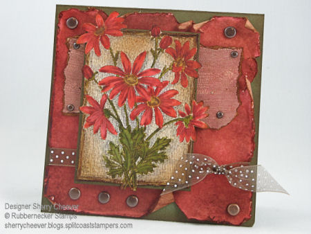
Now for my card. I knew I had the sentiment Dream and wanted to use it. The first thing that popped into my mind (more like association I think) was a Dream Catcher. As luck would have it, I also have assorted Southwest Images from Rubbernecker Stamp Company and a Dream Catcher is one of them.

Dream Card

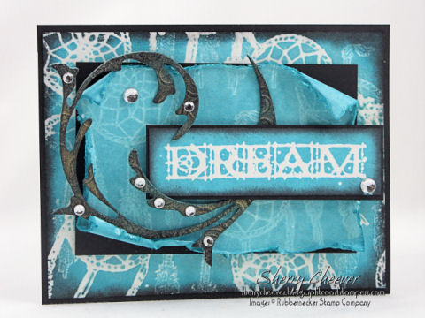
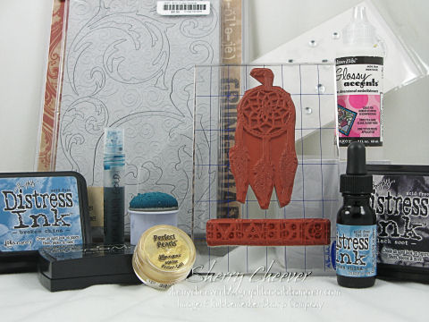
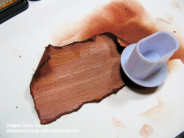
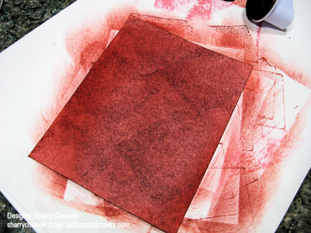
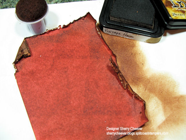
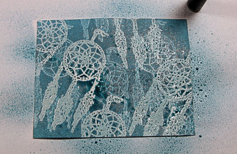
All three blue panels were made with Emboss Resist and then layered on black cardstock. The bottom two layers were sprayed with Shimmer Mist using a combination of Broken China Distress Ink and Gold Perfect Pearls. The Grunge Board accent was first sponged with Broken China Distress Ink and then using Black Soot Distress Ink, I wiped the pad directly across the Grunge to highlight the swirls in the Grunge. For additional highlights, I sprayed the same Shimmer Mist on the Grunge and set it aside to dry.

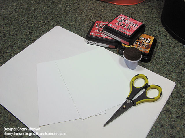
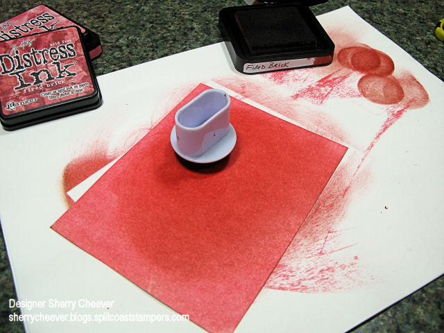
For the bottom panel, I combined various Embossing Resist Techniques. These are the products used for the technique.

Resist Products

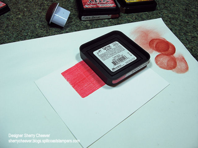
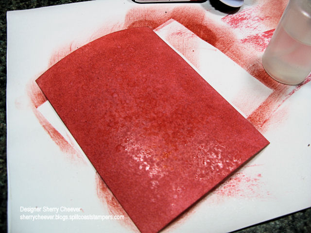
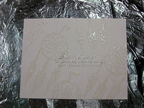
I started by randomly stamping the dream catcher with VersaMark on white cardstock.

VersaMark Image

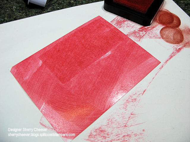
Using my heat tool, I heat set the VersaMark and then randomly stamped the image again, but this time I covered the VersaMark with Ranger UTEE.

UTEE

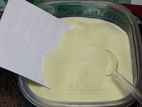
This is how I keep all my embossing powders. It is so easy to pick up a spoonful of embossing powders and shake off the excess back into the container. I also use a piece of cardboard covered in aluminum foil to emboss on. It seems to heat the paper from both sides and speeds up the embossing process. Using my heat tool again, I embossed the UTEE to obtain this result.

Final Embossed Image

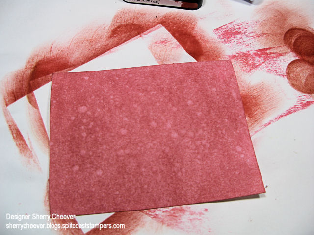
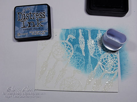
Using a dauber and working in a circular motion, Broken China Distress Ink was sponged over the embossed images. The plain VersaMark images will pick up a hint of the color of the ink and the VersaMark images embossed with UTEE will remain white.

Ink Sponging

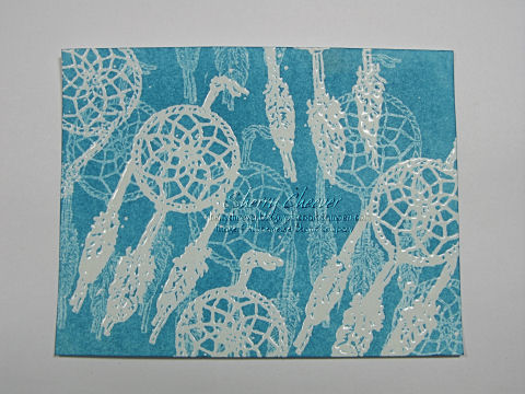
This is my finished background.

BG finished

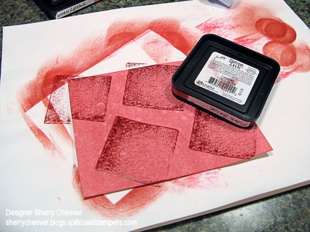
At this point, I added the Shimmer Mist for some additional depth to the background. As you can see from this photo, because of the embossing the Shimmer Mist will pool on the UTEE.

BG with Shimmer

Using a paper towel or rag, gently dab off the excess Shimmer Mist.

Wipe way Shimmer

For the middle layer of my card, I used only the VersaMark Resist. I then distressed the edges with scissors and sponged them with Black Soot Distress Ink. The sentiment panel is made using resist with the UTEE.

The Grunge Board Element was affixed to the card front using Ranger Glossy Accents. The bits of bling are Doodlebug Designs Jewels.

Stamps: Rubbernecker Southwest Collection 288-07 Dream Catcher and Stamp Oasis Sentiments Collection 1681 SO Mystic Dream Text by Rubbernecker Stamp Company

Paper: Neenah Classic Crest Solar White and Basic Black

Ink: VersaMark, Tim Holtz Broken China and Black Soot Distress Ink

Accessories: Ranger UTEE, Mini Mister and Glossy Accents; Tsukineko Sponge Dauber, Tim Holtz Idea-ology Grunge Board and Broken China Distress Reinker; Gold Perfect Pearls; Doodlebug Design Jewels

Products shown below, except for the Doodlebug Jewels, can be found on my favorite product page at Rubbernecker Stamp Company.

Card Product

Good Saturday morning! It just dawned on me that we have another long Holiday weekend coming up – WOO HOO! I’ll be hiding in my stamp room trying to be creative! My first Stamp Club meeting of the year is next Saturday, I have new SU stamps not yet mounted and projects need to be planned. The same day the SU pre orders arrived, I also received my new Tim Holtz Anthology stamps. Which by the way, Rubbernecker Stamp Company currently has on sale!

Mallory was home the day the Anthology stamps arrived and needless to say, she went nuts over them. I also have had some Grunge Board around here for the last few weeks, which Mallory had already been into. Being my typical daughter, she wanted to know if I was going to make her a new journal to take back to school. The thought had crossed my mind, but her asking me to make one was just the push I needed. We sat down, discussed what colors she would like, and I went to work last night.

I think today, the first thing I will do is show you the products used to make the journal. This might turn into a mini tutorial of sorts and I would rather you know what is being used as we go along.

Dec 29

The list of what I used: Zutter Bind-it-All, 3/4″ Double OWire Binding, 7.5 x 5″ Chipboard Cover; Tim Holtz Distress Inks; Tsukineko Sponge Dauber; Tim Holtz Anthology Stamps, Tim Holtz Grunge Board Elements; White Cardstock; 6×9″ ruled writing tablet; and Mod Podge. (Most of these items you can find at My Favorite’s Page, and they also happen to be on sale.)

Anthology Journal Cover

To start, cut the white cardstock to size so that you have four pieces to cover the front and back of the chipboard covers. Using Dusty Concord, Weathered Wood and Broken China Distress Inks, work the color onto the white cardstock with a sponge dauber, and then sponged the edges with Black Soot Distress Ink. (You can find these specific techniques in my Distressing Tutorial). Once these pages have dried, stamp the main images randomly using Black Soot. To add more texture to the pages, stitching around the edges was done with black thread.

To begin preparing the journal, the edges of the cover were inked with the Black Soot Distress Ink and then sponged toward the middle of the cover. (Since this particular journal is not covered completely with designer paper, I did not want the edges of the covers to show.)

Adhere the paper to the covers using Mod Podge. A thin coat of Mod Podge was painted on the cover, the paper was placed on the cover and using a brayer, roll across the top of the paper to get out any air bubbles and to make sure that all edges of the paper are adhered. This is important when running a cover through the Bind-it-All, so that the paper around the punched holes doesn’t come loose.

If you like lined pages in a journal, you can trim down the pages of writing tablet. These pages were trimmed down to 7-1/4″ x 4-3/4″ so that they would fit in the journal, but not come out to the edges.

We are not ready to assemble the journal. I find it easiest to work in order and assemble in order. Starting with the back cover, and using the Cover setting [C] on the Bind-it-All, line up the cover, press down in the center and then punch the first set of holes. To continue along with the line of punching, set the Bind-it-All to the Continuous setting [B], line up the next to last-punched hole in the notch, and continue punching. It is important to line up the next to last-punched hole, leaving one at the end, so that the punching will be continuous. You’ll find that if you don’t do this, you will have a gap in the holes. (How do I know this, well – I’ve done it!) At this point, I go ahead and punch the front cover and set it aside.

For the inside pages, use the Inner Pages setting [D], butt the edge of the paper up to the end, press down in the center and punch the first set of holes. Continue punching the remaining holes using the Continuous setting [B] as with the covers.

Once all the pages are punched, assemble the journal back to front as it would look when bound. Now here is the important part – flip that back cover over to the front, just as you would if it was attached with the coils. So what you have in order is, inside back cover, outside front cover, lined pages. Now thread the binding through the pages so that the square edge is on your left. To bind the journal, set the Bind-it-All to the width of the bindings. For this journal, 3/4″ since we are using 3/4″ Owires. Hold the journal by the covers and pages, placing the Owires into the binding section. Gently press the down on the handle until you feel the Owires come together.

To finish the front of the journal, I picked the largest Skull and Cross-Bones from the Grunge Board and covered it with Weathered Gray Distress Ink. I worked the ink down into the grooves of the Grunge Board, and then scraped the Dusty Concord pad across the top to highlight the design in the Grunge.

And here’s a picture of the inside of journal.

Anthology Journal Inside

This tutorial will refer to different distressing techniques that I used in making a sample card.

Distress Diasy

I have worked with Tim Holtz Distress Inks throughout this tutorial because of their ability to highlight and work smoothly on the paper. With these inks, you can keep adding color on top of color without losing the hues of the colors in the layers of ink.

There are times when you want a background that fits a particular image you are working with and you have to make it. You will need to gather some white paper, a dauber and ink pads.

Distress Supplies

To start with, take ink pad to paper and run the pad across the surface of the paper completely covering the paper.

Step 1


Step 1A

To make the ink smooth and cover your paper, use a sponge dauber and in a circular motion, work the ink around the paper.

Step 1B

To add more depth to the paper, now add a darker hue of the same color on top. To do this, use your dauber and in the same circular motion, work the darker color on top of the existing color.

Step 1D

At this point, there are a few options you can add. Let’s start with crackle paint. I used Tim Holtz Scattered Straw Crackle Paint in this step on my sample card. Once you have your paper colored, paint on a layer of the Crackle Paint. The cracking achieved depends on how heavy you apply the paint. If your paint is heavy, the cracks are bigger and deeper. If you add a thin layer, there will be many smaller cracks.

Crackle Op 1

Once the paint starts to dry and the cracks begin to appear, you can speed the process up by using your heat gun.

Crackle Op 2

Once the paint is dry, it should look like this.

Crackle Op 4

The next part is the fun part. One way to distress the edges is to tear the paper along the sides and then sponge on distress inks.
Crackle Op 6

As you work the inks off the paper on, the edges will begin to curl for you if you add enough ink and work the paper enough. To make the crackles stand out more, as you work the ink onto the edges, you can drag the ink further onto the paper.

Crackle Op 8

Let’s look at making the final background layer. The first steps of applying ink to the white paper are the same. As an option, you could spritz the paper with water leaving a blotchy specked look to the paper.

Step 2A

Typically when you spritz the paper with water, the paper will curl. Never fear! Pull out your heat tool and dry the paper. As it dries, the paper will once again lay flat.

Step 2D

For my sample card, I decided to add more depth. To do this, stamp the darker ink pad randomly on the paper.

Step 3A

Then using a sponge dauber and working in a circular motion, even out the ink.

Step 3C

To distress the edges of this layer, (as in the sample card), use scissors. Scrape along the edges of the paper pulling the scissors toward you. It doesn’t matter if you accidentally cut the paper or tear it. To me, it just adds more character to the distressing.

Step 5A

When you start to sponge the edges, dragging in the ink from off the page, the edges will curl and form a shape of their own.

Step 5C

Distressing is one of my favorite techniques, and I hope you try these different styles of distressing.    All of my Favorite Products can be found here at Rubbernecker Stamp Company.

© 2015 Suffusion theme by Sayontan Sinha