Oh my BADness, I really didn’t mean for it to be so long before I shared my last Majestic Labels One project.  This one didn’t make the cut for CHA, which in one way makes me very happy . . .  it will now have a permanent spot on my studio wall!

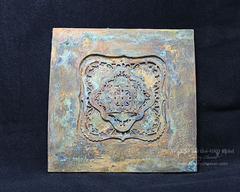
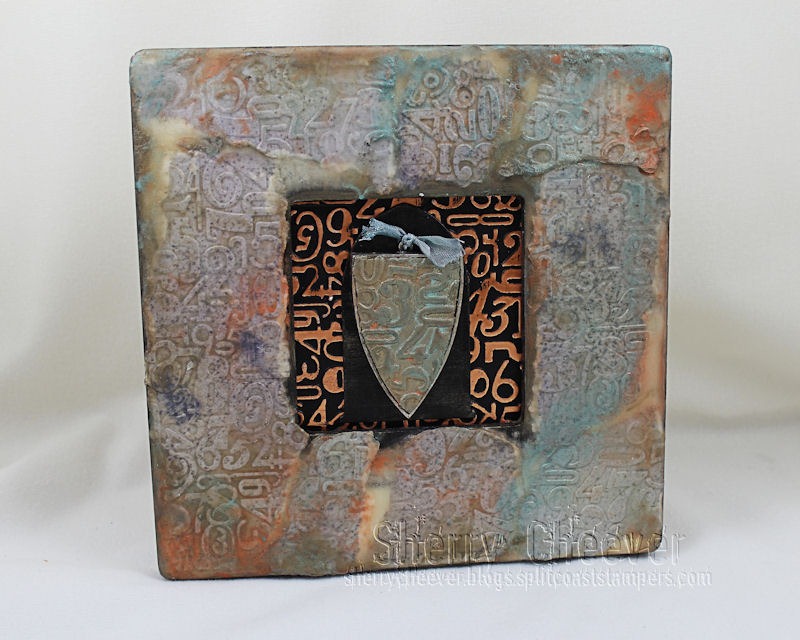
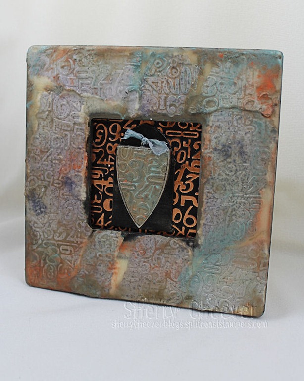
Lets talk about the frame first.  It’s made from chipboard that was die cut with Spellbinders® Grand Squares.  There were four pieces die cut with the square to form the actual base, that were all glued together and set aside.  The top part of the frame was made by leaving the Grand Square taped to the base plate and adding the Grand Labels One in the center.  Four or five pieces of chipboard were die cut for this layer and then glued together with the base piece that had been set aside.

(I failed to take pictures of this process, but if there are enough interested in the process leave your comments and I’ll recreate it for you).

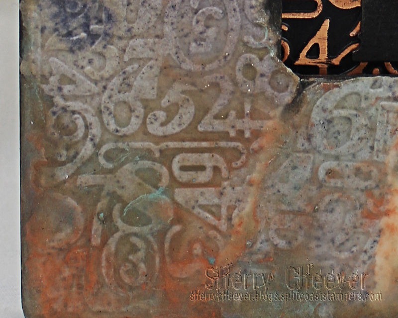
The frame was painted black  and portions of it were covered in white crackle embossing paste.    (I thought the frame was going to process from there into something I could submit for CHA . . . but I changed my mind at the last minute and pulled out my Ten Seconds Studio patina paints.)

I started applying layers of bronze and iron patina paints, letting them dry thoroughly.  From there additional layers of paint were applied and misted with patina solution. Ten Seconds Studio has excellent video tutorials on this process so I won’t re-create the wheel . . . Please hop over to their YouTube Channel and see what the fuss is all about.

The inside of the Labels One opening is watercolor paper that I die cut/embossed with Majestic Labels One painted in the same way as the frame.  My post on the mini pizza box tells in detail how the Majestic Labels One were die cut/embossed.

Just look at all the wonderful patina and textures created.  The orange patina is from the Iron paint, the greens are from Bronze and Copper paint.

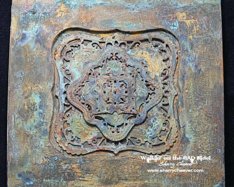
I absolutely love how the patina ran into the cracks of the crackle embossing paste!  This entire piece reminds me of an old kitchen tin tile that has been left out in the weather for years and years.

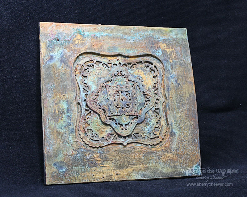
I am amazed at the results achieved with simple chipboard and some paint!  The middle pieces were glued down with E6000 adhesive.

I wonder how cool it would be to make three more of these, all with different elements, and made them into a larger wall hanging?    Hmm maybe some projects down the road!

Well anyway, that’s my CHA reject.  So happy that it was because it sure wouldn’t be here with me!!

Thanks for stopping by and joining me today!

SHERRY SIGNATURE

Project Supplies:

Good morning!  Well, I thought I would get this project written up and posted a little earlier (like yesterday), but apparently it didn’t happen.   I started working on a another project (while Hadlee was napping) for the eclectic Paperie Challenge this week, but honestly . . . I didn’t get too far.

Anyhoo, for the project I have to share today.  It’s one I submitted to Spellbinders™ for CHA.  I’m assuming it got there and was in the booth . . . I still haven’t seen pictures of this particular one.  My assignment for this one, was the new LF-018 Grand Decorative Labels One.

CHADecoGrandLabelsOneFrame

Graphic 45 Olde Curiosity Shoppe Collection was used for the project.  Each layer is the G45 paper die cut with the Grand Decorative Labels One, which was then mounted on a piece of thin chipboard that had been die cut with Grand Labels One.

CHADecoGrandLabelsOneFrameCLOSEUP

The depth for the frame was created by die cutting multiple layers of thin chipboard with Labels One.

CHADecoGrandLabelsOneFrameCLOSEUPButterfly

The butterfly was cut out twice, with the second covered in Spiced Marmalade Distress Stickles and mounted over the top of the bottom butterfly.

CHADecoGrandLabelsOneFrameAngle

That’s all for me today and I think this I my last CHA project to share.

Thanks for stopping by and I hope you have a great day!

SHERRY SIGNATURE

Project Supplies:

Good morning!  I thought today I would talk about my second project on the Spellbinders™ Sneak Peek and Giveaway!

After my initial project (the layered arches) was done, I was boggled with what my second project should be with the assigned dies.  I had a ball working with the beeswax on the first project and thought why not carry it on over into the second.  The problem then was . . . what.  I finally settled on pulling out one of the $1 frames from Michael’s that I had down in my class surplus.

SCheeverBeeswaxFrame MYCOPY

The first thing I did, was to add some color to 140 lb. watercolor paper by misting it with Heirloom Gold Perfect Pearls mixed with Dusty Concord, Spiced Marmalade and Tumbled Glass Distress Ink Refills.   While the paper was still damp, it was embossed with the new EL-027 Numbers and Letters M-Bossabilities Folder.  Of course, I used an entire sheet of the paper which needed to be torn and the individual pieces run through the Grand Calibur in the M-Bossabilities.

My goal was to make this project look more distressed than the first, but not dark . . . I wanted color!

Following the same steps used in the other project, several layers of beeswax was applied to the bare wood frame, to give the paper something to adhere too.  Now this is where everything went awry . . .

SCheeverBeeswaxFrameCLOSEUP EMBOSSING MY COPY

I started tearing the watercolor paper into strips and applying it to the frame with more layers of beeswax, adding different colors of Perfect Pearls as I went.    The more I messed with it, the more layers of wax I had, some of the paper wasn’t sticking, and the more I added the worse it got.

Finally, when I had all the paper down and I kept seeing the wax pooling in odd places, I finally game up and dropped a roll of paper towel onto the project.  It picked up just enough of the melted wax to leaving me the color of the paper and the added colors of the Perfect Pearls.  I stopped right there!

I kept worrying about the white wax that was showing and fretting over it was part of my problem.  Once I stopped and let the piece dry . . . well, I decided I liked the white and left it alone.

SCheeverBeeswaxFrameCLOSEUP MYCOPY

I used one the left over chipboard die cuts from the other piece as the background for the shield bezel and painted it black.  The bezel, which is open-backed and an old one I had here from the Art Mechanique line, was placed on the Numbers and Letters M-Bossabilities and then I poured melted beeswax into the bezel.  Once the wax was cooled and I could remove the bezel, Perfect Pearls were used to add some color.  Before I forget, the colors of Perfect Pearls used on the project were Mint, Heirloom Gold and Mandarin.

The background for the inside of the frame is Royal & Langnickel Copper Foil Engraving Board.  It was embossed with the Numbers and Letters M-Bossabilities and then sanded to reveal the copper foil underneath the black coating.

SCheeverBeeswaxFrame ANGLE MYCOPY

I think that’s all for right now!  I’ve got a few more CHA projects to share, but of course . . . you’ll have to wait until the show starts and the die templates are live on the Spellbinders site.

Thanks for stopping by . . . oh and maybe I’ll get that other flower tutorial done this weekend when I’ve got some “ME” time to head downstairs and work for a few minutes.

SHERRY SIGNATURE

Project Supplies:

© 2015 Suffusion theme by Sayontan Sinha