
Happy Friday! Today is the next installment of The E-Team’s Get Distressed Hops . . . Wrinkle-Free Distress!

Wrinkle-Free Distress is one of my favorite techniques and I wrote a tutorial for Splitcoaststampers some time ago, which you can find here. For other samples I have on my blog you can click on the Wrinkle-Free Distress category on the side, or you can click here.
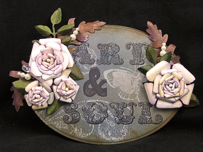
For my project today, I’ve used mainly watercolor paper and illustration board . . . No Grunge! For some reason I got it into my head that I wanted to make flowers from watercolor paper, AND I the watercolor paper had to be used with the Wrinkle-Free Distress Technique. I’ve used watercolor paper in the past with the technique, and love the results I achieve . . . I’ve just never made flowers with it.
Here’s my final project
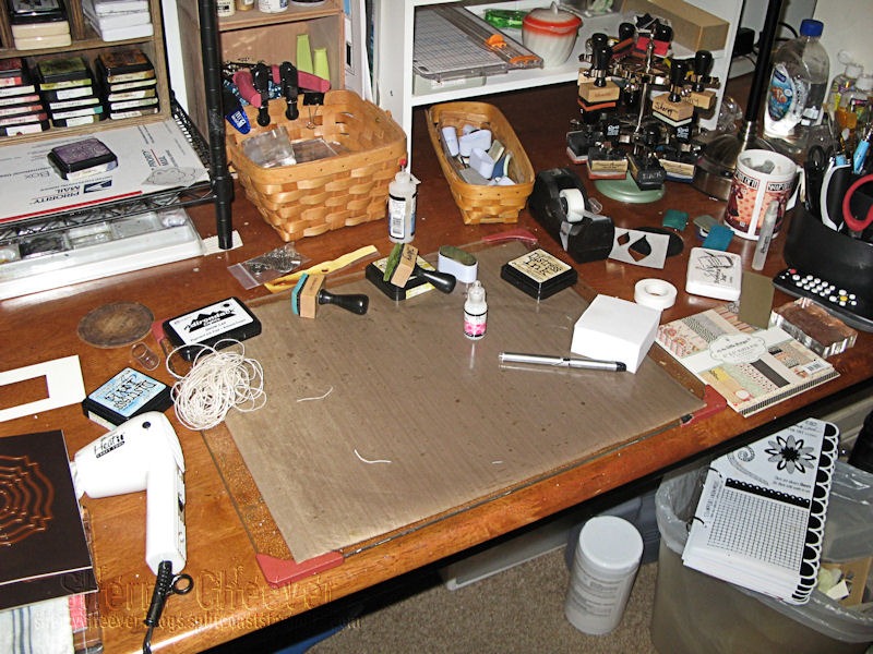
and now for some step-by-steps.
The first thing I did, was to prime my watercolor paper.

I misted the paper with water to open up the fibers and allow the color to soak further into the paper. By doing this, the heavy color of the ink didn’t sit on top of the watercolor paper. I let the paper dry, but not completely, only until the shine of the water had disappeared and then I misted it again. While this second misting was drying, I put down my colors of ink . . .

Broken China, Dusty Concord and Wild Honey.
Before the watercolor was completely dry, I picked up my first layer of color and then hit it with my heat gun to dry the top layer of color. I continued to pick up layers of color until I was satisfied with the outcome.
Now comes the cool part of working with watercolor paper. When the paper is dry, it’s stiff and brittle. If you mist the paper with just a tiny bit of water, it becomes flexible. To shape my flowers, I misted the back with water and let it sit for a few minutes and when the paper was pliable, I started shaping the different petals. When the paper dries again . . . it holds it’s shape!

The leaves for the flowers were done the same way. However, once I got them die cut out and started arranging them on my background, they were way too light.

I ended up misting over them with Meadow Color Wash and then grabbed a pre-mixed mini mister of Vintage Photo with Copper Perfect Pearls. While the leaves were still damp, I could shape them and let them dry thoroughly. The difference in color is amazing, isn’t it?
The larger leaves started out purple but ended up much darker because they were just too light. Once again, I hit them with some vintage photo/copper and some Dusty Concord mini misters. (What I mean by this is, I placed dropper of the reinker in a mini mister, added some Perfect Pearls (if used) and then filled the mini mister with water.)
For my background, I die cut a piece of illustration board with Spellbinders Grand Ovals. Before I did anything else to the background, I stamped the butterfly and flourishes in Snowcap Pigment Ink and let it dry completely. I then added . . . and not necessarily in this order . . . Tumbled Glass, Dusty Concord, Stormy Sky and Vintage Photo Distress Ink. This is a technique (Pigment Resist) that Wendy Vecchi has perfected and you can see more about it on her blog, Studio 490.
The words were then stamped in Jet Black Archival Ink and then the entire piece was assembled! Fun, Fun, Fun!

Now that you’ve seen my project, it’s time for you to visit the rest of The E-Team:
Daisy Sparks
Broni Holcombe
Latrice Murphy
Linda Duke
Linda Ledbetter
Micki Harper
Starla Nelson
Leave them lots of love and a comment, because two lucky readers will be receiving a special prize from Daisy and eclectic Paperie. To be eligible, just leave a comment . . . Daisy will randomly choose two winners from those comments!
Thanks for stopping by today and remember . . . life is short, embrace the adventures of the day!

Product Used:


