Good morning! We are into Day 3 of the Lizzie Anne Designs’ Summer Release Sneak Peek! Don’t forget to visit Tricia’s Blog, Letters from Lizzie, and Meridith’s Blog, Little Treasures. Not only will they have some sneak peeks for you, but they also will be linking other Design Team members who do. This is the last sneak peek I have for you. I’m off to Chicago and CHA this morning! I’ll be blogging from there the rest of the week.

Today’s card is made with the new set, Holiday Lane. I’ve only used one of the images from the set, but I can envision a fabulous street scene. Once I’m back from CHA, I’ll be working on that for you!

LAD Holiday Lane Preview

I stamped the image on watercolor paper and painted the image with reinkers. To make some snow, I dabbed on Tulip White Puffy Paint and then heat set. I pulled out some of my favorite holiday paper, BasicGrey Figgy, for the background. I couldn’t resist using the sentiment “Up on the housetop . . .” because of Santa’s sleigh on the roof and his boots caught in the chimney!

  • Stamps: Holiday Lane from Lizzie Anne Designs
  • Paper: Canson 120 lb Watercolor; SU Soft Sky and Basic Gray; BasicGrey Figgy
  • Ink: Tsukineko Brilliance Graphite Black; Ranger Tim Holtz Weathered Wood, Broken China, Mustard Seed, Fired Brick, Shabby Shutters, Peeled Paint and Faded Denim Distress, Archival Jet Black
  • Accessories: Spellbinders Square Nestabilities; Word Window Punch; Ranger Distress Reinkers; Tulip White Puffy Paint; Water brush; Tsukineko Sponge Dauber; Mounting Tape; Brads; Ribbon

I hope you have a great day, and maybe I’ll have pictures with Tim Holtz tomorrow! Oh yeah . . . . while everyone else is taking the Copic Class, Jeanne and I will be in with Tim Holtz!

This week has flown by so fast! I can’t believe that it’s time for another JBWW (Just Because We Wanna) Challenge. This week it’s Jeanne’s turn to pick the challenge, and she picked distressing. You can just imagine how happy I was with that one! Yep, I sure was! As with every JBWW Challenge, if you participate (which we hope you do), and post a card to your blog, please come back and link your card to either my blog or Jeanne’s, Inky Paws. If you upload to your Gallery on SCS, please use the keyword JBWW. If you’ve just stumbled across this challenge for the first time, please feel free to participate – the more the merrier!!! We love it when ya’ll play along with us.

I’ve had a number of requests about distressing, and how I get those curled edges, etc. Pamm (HRSECZY on SCS) emailed me last week about this very thing. So while I was making today’s JBWW card, it occurred to me that is was an excellent opportunity to talk distressing. I’ve made a separate Distressing Tutorial, and it is the post immediately following this one.

First, let’s talk about today’s JBWW card. I chose to work with a daisy image from the Bold Floral Collection from Rubbernecker Stamps today. I stamped in the image on watercolor paper then water colored using Ranger Tim Holtz Distress Inks. Once the image was dry, I trimmed it out from the paper and distressed the edges of the frame only. To add more depth to the image, I decided to sponge Vintage Photo Distress Ink along all the edges, dragging it across the front of the image. By dragging the ink across the panel, it highlighted the water coloring of the daisies. The two background panels started out as white cardstock that I sponged a combination of Worn Lipstick and Fired Brick Distress Inks on. For the background immediately behind the daisies, I used Tim Holtz Crackle Paint, tore the edges of the paper off and again sponged the edges. The bottom background panel has some added Fired Brick Paint and the edges were distressed with scissors and sponged. (More detail on all the distressing follows this post in the Distressing Tutorial).

Distress Diasy

Stamps: Daisy by Rubbernecker Stamp Company

Paper: Watercolor, White and Green Cardstock

Ink: Frayed Burlap, Vintage Photo, Fired Brick, Tattered Rose, Peeled Paint, Scattered Straw, Worn Lipstick, Shabby Shutters Tim Holtz Distress ReInker; Fired Brick, Vintage Photo, Worn Lipstick and Weathered Wood Tim Holtz Distress Ink Pads

Accessories: Watercolor Brushes, Tsukineko Sponge Dauber, Brads, Ribbon, Mounting Tape, Scissors, Tim Holtz Scattered Straw Crackle Paint

The following picture is of all the products I used to create this card, and can be found at Rubbernecker Stamp Company. I did make one mistake and included the crackle background that I decided not to use and did forget to include my ATG Gun. Sometimes ya win, sometimes ya don’t! One more thing, Rubbernecker is having their Winter Sale Event — check out all the great things on sale!

Distress Diasy Product

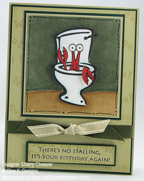
Hey it’s that time of the week again – time for the JBWW Challenge! It’s my turn to host this week, and I’ve got a sketch for you that is so much fun! You can showcase those little stamps in a set or you can create a background using any technique and go to town. I myself chose to use individual stamps. Remember to come back and post a link to either my blog or Jeanne’s blog, Inky Paws. Oh yeah, and don’t forget to use keyword JBWW if you upload to you SCS Gallery.

JBWW Sketch 5

Before I start with the deets of my sample card today, let me answer a question from yesterday. Julie (joypup on SCS) left this comment and question: “I love your card, Sherry! 3×3’s are dear to me, too… thanks for the heads up on the Distress reinkers — but could someone tell me why they are “distress” inks? What makes them special???”

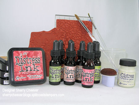
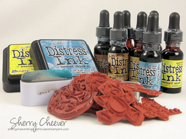
I like the Tim Holtz Ranger Distress Reinkers and Pads because of the vibrant colors they have and the different tones they take when water coloring with them. Plus, you gotta love the names. If you have ever noticed when, water coloring with SU’s Classic Old Olive, the ink takes on different hues or tones. Well, all of the distress inks do, and the different hues they take on are so gorgeous. You can emboss with them as I found out this week, and they are the only ink that I distress the edges of my paper with. They stay wet a little longer than other dye inks and a little bit will go a long way. Here are a few facts about the Distress Inks that make them different from other inks and some of the reasons I like them:

  • The color is stable and maintains it’s integrity. They won’t fade over time or break down when wet. In other words, they won’t fade like other dye inks.
  • They are reactive with water, so when wet the inks actually travel out or “wick” across the surface. (I created a background panel the Friday where I completely soaked a piece of watercolor paper with water and dropped on little drop of reinker in the center. The ink spread completely across the panel. All I had to do then was take a wet paint brush and even out the color.)
  • They can also be used to tint black and white photos. As I said before, a little bit of ink goes a long way and using a Cut-N-Dry nib allows you to get into small detail areas with just a little bit of ink.

I think that above covers the distress inks but if you have any other questions, don’t hesitate to ask.

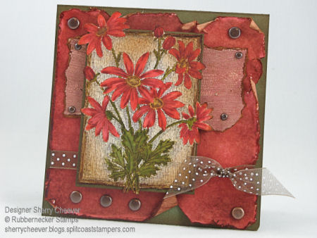
Moving on to my sample card today! As I said earlier in the post, I decided to watercolor my images today. All the images used are from Rubbernecker Stamp Company and are part of the baby collection.

RNS JBWW 5

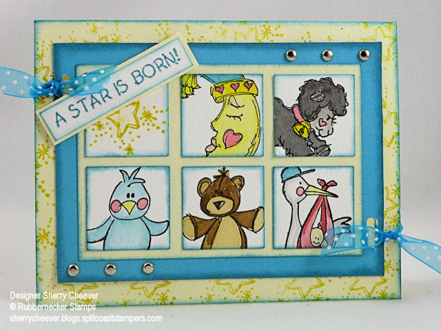
I stamped each image on watercolor paper with Black Stazon and then painted the images. Well all except for the star square – I stamped that one. Using a 1-1/4″ square punch, I punched out the images and then sponged the edges with Broken China Distress Ink. To make the pattern of squares straight and even, I started with a larger piece of yellow cardstock and glued down the squares in the pattern eyeballing the space between the squares. This panel was then trimmed down leaving the same amount of space on the outer edges of the squares as on the inside. After the edges of this panel were sponged with the Distress Ink, I glued it down to a piece of turquoise cardstock. That cardstock was then trimmed to a 5/16th edge (I used my Perfect Layers for this). To add some dimension to the front of the card, I stamped the star image all over the front with Mustard Seed Distress Ink, and sponged the edges with Broken China. I added the brads to the main image panel and then placed it on the card front. (I didn’t want my brad butts to show – hehe). Using a slot punch, I punched two holes through all the panels and ran the ribbon through and tied it off. The sentiment was stamped out in the Broken China on watercolor paper, trimmed, sponged, mounted on turquoise cardstock and then placed on the top panel with a small piece of mounting tape.

Stamps: 88-01 Lamb, 88-13 Sleeping Moon, 88-09 Star is Born Text, 88-10 Stork, 88-06 Stuffed Bear, and 88-11 Stuffed Chick from Rubbernecker Stamp Company

Paper: Watercolor paper, Prism Iced Yellow, Turquoise

Ink: Stazon Black; Tim Holtz Ranger Broken China, Mustard Seed, Scattered Straw, Tattered Rose, Worn Lipstick, Black Soot, and Brushed Corduroy Distress Inks

Accessories: Watercolor Brushes, Perfect Layers, Brads, 1-1/4″ Square and slot punches, Tsukineko Oblong Sponge Dauber

Before I leave you today, and to follow along with the prior discussion of Distress Ink, these are all the products that I used today to make this card, and all of them can be found at Rubbernecker Stamp Company.

Baby Card Products

Good morning! It’s time for another JBWW Challenge. Jeanne and I decided last week that from now on, the weeks I host, you will be getting a sketch. Then on the weeks that Jeanne hosts . . . . well, it will be whatever she can dream up. Well guess what, it’s Jeanne’s turn this week and boy has she chosen a good one – Something’s Fishy! Yep, she wants you to pull out those sea critter stamps (crabs, fish, clams, etc.) and use them. Remember, to come back and post a link to either here or on Jeanne’s blog, Inky Paws, and if you are uploading to SCS, please use the keyword, JBWW.

I have two different cards today. The first is using images from Rubbernecker Stamps. I stamped the images in Adirondack Pitch Black and then colored them with Copic Markers. Stickles were used for the bubbles and a gel pen used for the water flow. The background paper, Memory Box Studio, was sponged with Adirondack Stream in a circular motion over the entire paper in order to blend better with the image.

RN Luncheon Meeting

Stamps: 86-17 Luncheon Meet and 86-14 Under the Sea by Rubbernecker

Paper: Neenah Classic Crest Solar White; Black, Memory Box Studio

Ink: Adirondack Pitch Black and Stream

Accessories: Copic Ciao Markers, Sponge Dauber, Mounting Tape, Blue Gelly Roll Jell Pen, Ranger Crystal Stickles, Brads, Ribbon

The second card today uses stamps from Gina K. Designs. The potty was stamped first and colored with Copic Markers, along with the background of the image. The crab/lobster (I think it can be either) was then stamped, colored and mounted inside the potty. One claw, hanging over the edge, is raised on mounting tape for dimension. The background of the card was stamped with the sentiment Way to Go in River Rock on River Rock.

GKD There’s No Stalling

Stamps: Just Be-claws and Way to Go! From Gina K. Designs

Paper: Georgia Pacific White, SU River Rock and Handsome Hunter

Ink: Palette Noir Black, SU River Rock and Basic Black

Accessories: Copic Markers, Ribbon, Mounting Tape, Black Artists Pen

Good Morning! I hope y’all have had a nice holiday weekend. Let’s get right to the JBWW Challenge today. Last week we had a request for a sketch. So, since it is my week to host the challenge, I came up with a sketch for you. Please remember to post a link of your finished card here or on Jeanne’s blog, Inky Paws, and if you upload to your SCS Gallery, please use keyword JBWW.

JBWW Sketch #4

I’ve posted a sample below. If you are a Splitcoast Fan Club Member, you will be able to see the first card that I did with this sketch here. I thought it would be fun to try this sketch again, and to see what your interpretations would be.

I decided to use a stamp from Rubbernecker today. We have anticipated the opening of Rubbernecker’s new site all weekend, and are just as anxious for the site to open as you are. The Design Team has been waiting in the wings and are so anxious to show you what they’ve been working on. The image was stamped on Georgia Pacific white cardstock and colored with Copic Markers. It’s very hard to tell the photo, but the stars on the ladies scarf, the dots on her hat and the man’s bow tie and buttons are colored with a gold Spica maker. The snowflakes have been highlighted with a Sakura Stardust pen. The edges of the image and the sentiment were sponged with Old Paper distress ink and then highlighted with Walnut Stain distress ink. The edges of the background panels, BasicGrey Figgy, were sponged with the Walnut Stain distress ink and then sewn to a panel of River Rock. The circle was cut out using a Coluzzle and the edges were distressed. To make the edges curl more, I sprayed with paper with water, and then took my scissors to scrape along the edges. Before the edges dried, I curled the distressed area with my fingers, working the paper in toward the middle. Once the circle was completely dry, the edges were sponged with Walnut Stain distress in. This panel was then sewn to the background panel. Once I had finished assembling the card, I added Tulip White Puffy Paint for the snow, and used my heat gun to make it puff up.

Snow Couple JBWW

Stamps: K-1210 Snow People and Holiday Greeting Sentiment by Rubbernecker Stamps

Paper: Georgia Pacific White, River Rock, Artichoke, BasicGrey Figgy

Ink: Adirondack Espresso, Tim Holtz Ranger Old Paper and Walnut Stain Distress Inks

Accessories: Copic Markers, Sewing Machine, Gold Spica Marker, Sakura Stardust Pen, Coluzzle, Single Stitched Ribbon, Sponge Dauber, Mounting Tape, Tulip White Puffy Paint, Heat Gun

© 2015 Suffusion theme by Sayontan Sinha