eclectic Paperie  and Add a Little Dazzle Blog Hop. Welcome to our joint blog hop with Add a Little Dazzle. We are so excited to partner with them and have had so much fun playing with their products.  They have a beautiful collection of metal sheets, in a variety of colors, that are perfect for mixed media projects. Both design teams have combined our products and are ready to share some inspirational projects with you. Join in on the fun and make sure to enter for a chance to win an amazing prize.

ECLECTIC PAPERIE AALD BLOG HOP BUTTON

Welcome to Day 1 of  the Eclectic Paperie & Add a Little Dazzle joint blog hop! We’re so excited to be sharing some fabulous creations featuring the wonderful products from both companies in today’s hop. We have two amazing days of inspirational projects so make sure to stop by tomorrow.

First we’d like to share a little bit about the two companies…

eclectic paperie

eclectic Paperie is a different breed of craft store, conceived as more than just a place where you can purchase supplies, we believe in the strength of collaboration, in coming together and sharing with like-minded crafters. Our goal is to offer a mixed media marketplace where a generation of artists can congregate, explore, imagine, and inspire one another.

Sweet 'n Sassy Stamps and Add a Little Dazzle Blog Hop

We specialize in an exclusive line of craft metal sheets that helps you take your crafting to the next level. Whether you are a seasoned or new crafter, our craft metal sheets will help you create unique projects that will make you stand out among the crowd. Are you ready to take your crafting to the next level? Add a Little Dazzle Craft Metal Sheets will help you turn the ordinary into the extraordinary.

Prize Alert!

Make sure to stop by and visit each of the Design Team Blogs for a chance to win 1 of 2 prize packages from eclectic Paperie and Add a Little Dazzle valued at $25.  You have until Friday, June 27th to enter.  The winners will be announced on both blogs on Saturday, June 28th. You must leave a comment on all blogs.

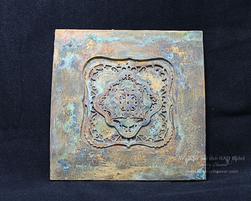
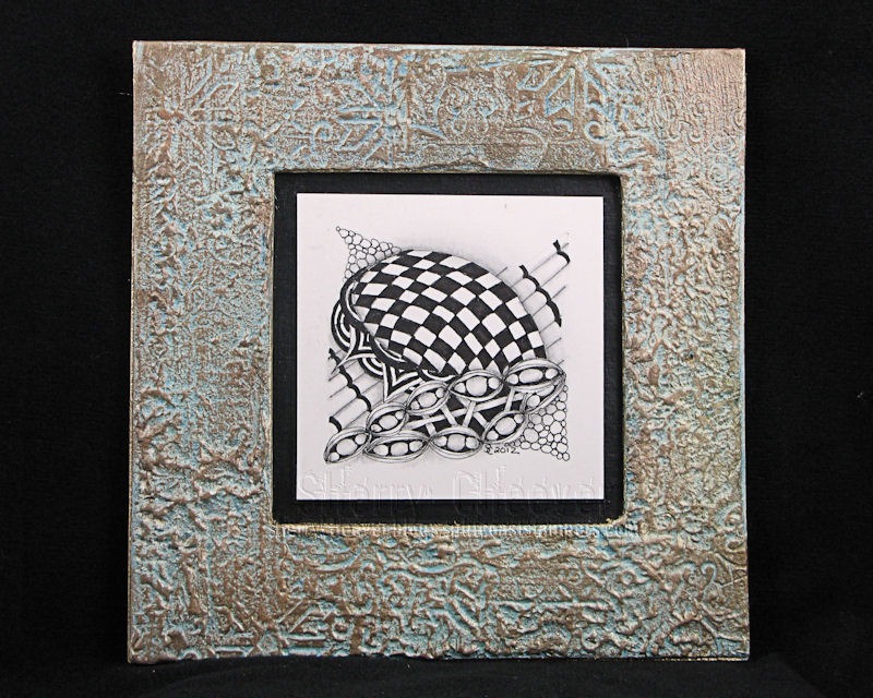
For my project, I decided to make a mixed media canvas using a 6×6 stretched canvas and a Precious Pearl metal sheet.

DazzleCanvasLeft

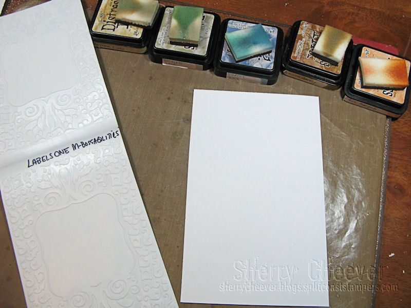
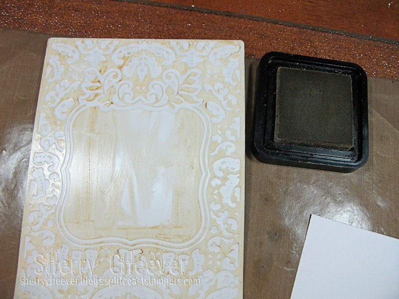
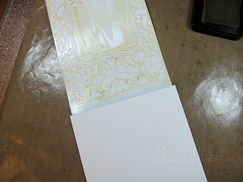
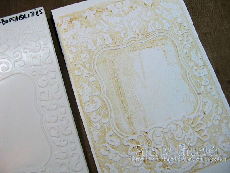
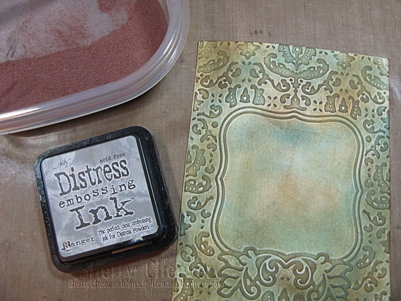
Using a sheet of Precious Pearl Metal from Add a Little Dazzle and the Spellbinders 3D M-Bossabilities Labels 34 Medallion, the metal was embossed and embossing paste was applied to the back to ensure the embossed areas did not flatten.

DazzleCanvasStep3

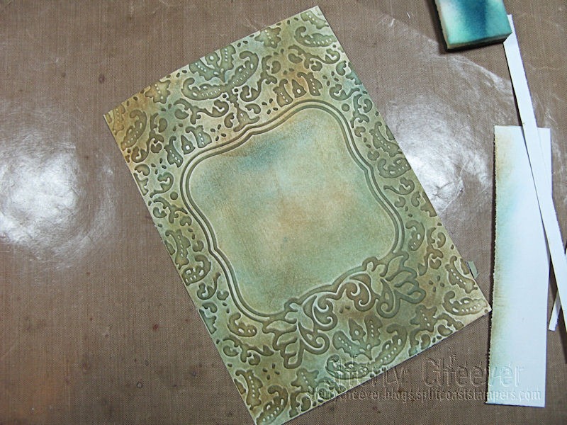
The canvas was painted with shades of buff, gray and linen before highlighting with copper and bronze patina paints applied with a sea sponge.  The canvas was allowed to sit and dry, then sponged again with the copper and bronze patina paints.  A reactive solution was misted on while the second round of paint was still wet.  After sitting over night, the canvas looked like this (the green areas are the patina).

DazzleCanvasStepA

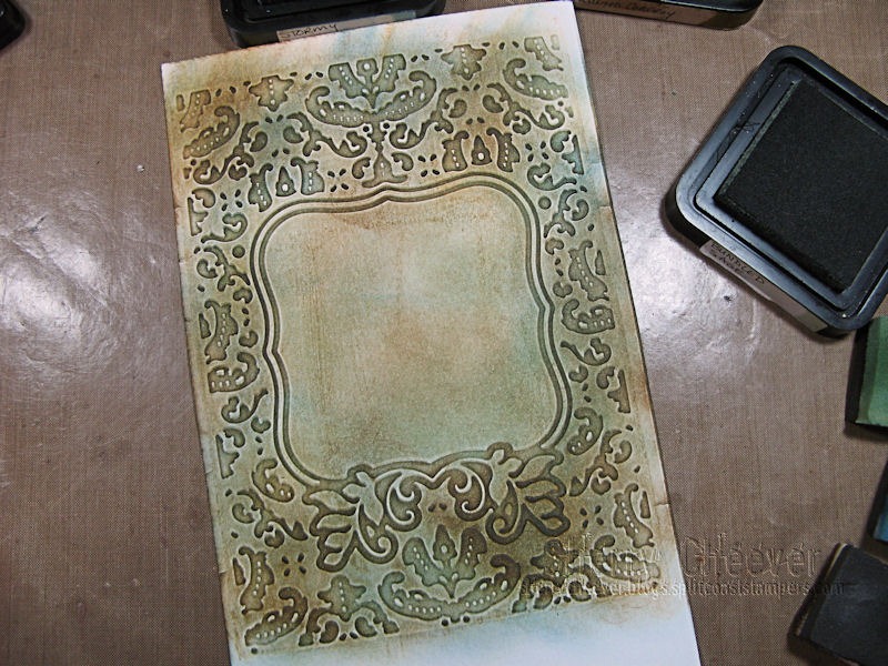
At the same time the patina paints were applied to the canvas, a lighter version was applied to the metal.  This was also misted with reactive solution and left overnight to dry.

DazzleCanvasStep2

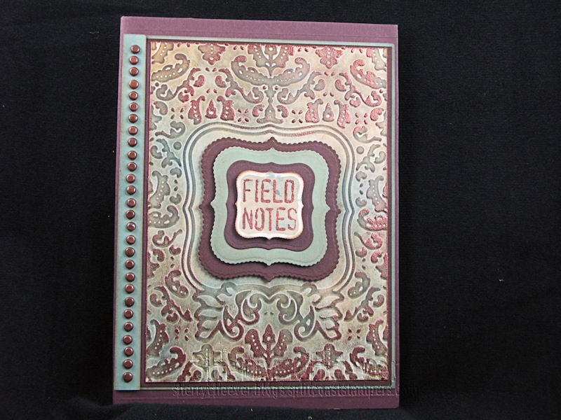
I wanted to have the medallion raised on the canvas, so chipboard was die cut with Spellbinders Labels Thirty-Four

DazzleCanvasStep4

and glued together to make a base for the metal medallion, which was trimmed out from the metal with scissors.

DazzleCanvasStep6

Because I wanted the edges of the chipboard to match the canvas, a coat of Bronze patina paint was painted around the edges and top before misting with the reactive solution.

DazzleCanvasStep7

The medallion was then glued to the front of the canvas was E6000 adhesive.

DazzleCanvas

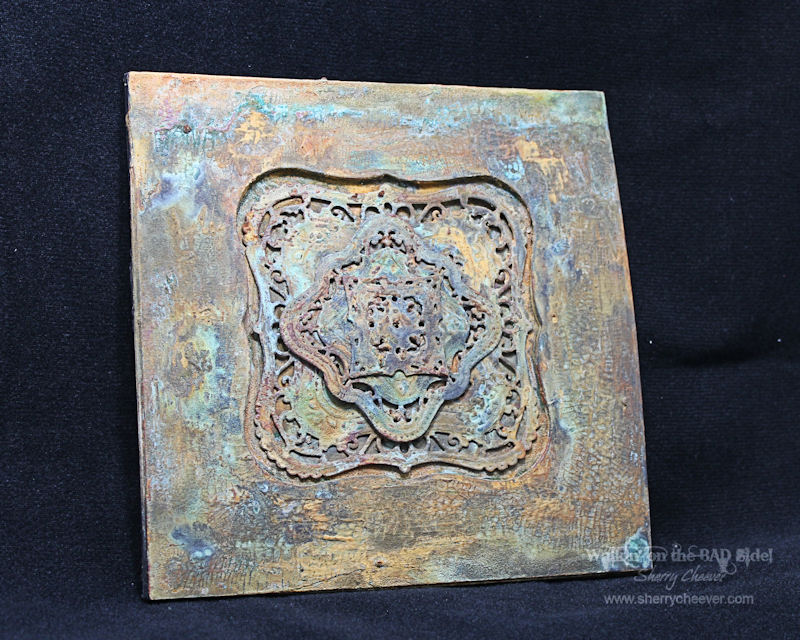
I don’t know where I’m going to hang this yet (maybe the remodeled bedroom), but I do know that there needs to be a couple of companion pieces made (once I settle on which embossing folders to use).

DazzleCanvasRight

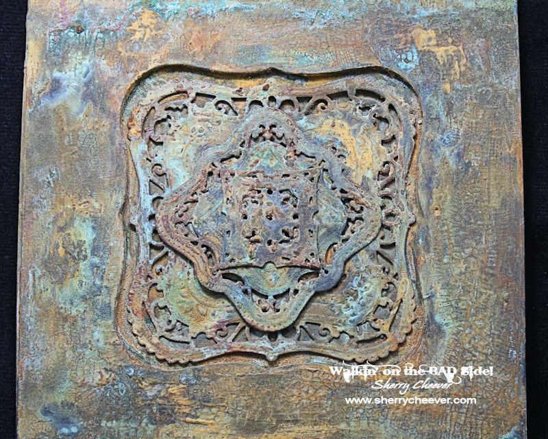
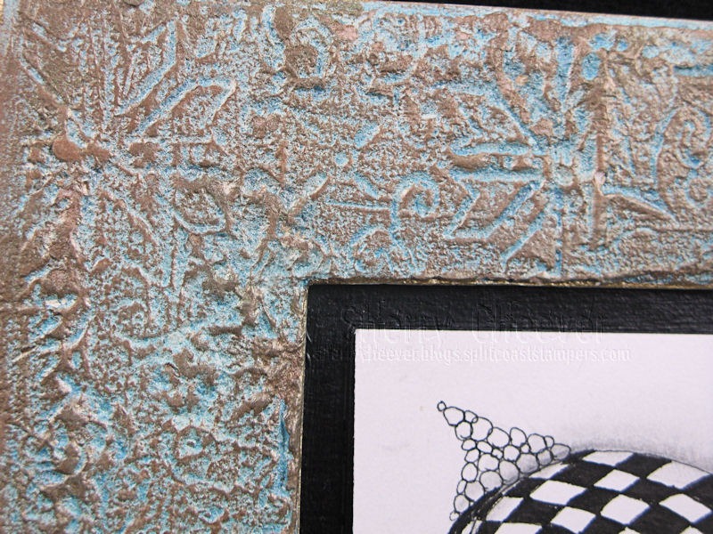
How about a close-up of the medallion on the canvas.  I love all the patina areas (so glad I decided not to sand the metal).

DazzleCanvasCloseUP


Tomorrow You Can See More!

Visit Eclectic Paperie and Add a Little Dazzle tomorrow for Day 2 of the Blog Hop!


Please make sure to visit all the other designers participating today:

Monica Weaver
Bonnie Irvine
Kim Schofield
Martha Lucia Gomez
Sherry Cheever YOU ARE HERE
Sue Lelli
Toni Burrows
Lydia Walker
Adriana Templeton


Thanks for stopping by and joining me today!


SHERRY SIGNATURE


Project Supplies:


Oh my BADness, I really didn’t mean for it to be so long before I shared my last Majestic Labels One project.  This one didn’t make the cut for CHA, which in one way makes me very happy . . .  it will now have a permanent spot on my studio wall!

Lets talk about the frame first.  It’s made from chipboard that was die cut with Spellbinders® Grand Squares.  There were four pieces die cut with the square to form the actual base, that were all glued together and set aside.  The top part of the frame was made by leaving the Grand Square taped to the base plate and adding the Grand Labels One in the center.  Four or five pieces of chipboard were die cut for this layer and then glued together with the base piece that had been set aside.

(I failed to take pictures of this process, but if there are enough interested in the process leave your comments and I’ll recreate it for you).

The frame was painted black  and portions of it were covered in white crackle embossing paste.    (I thought the frame was going to process from there into something I could submit for CHA . . . but I changed my mind at the last minute and pulled out my Ten Seconds Studio patina paints.)

I started applying layers of bronze and iron patina paints, letting them dry thoroughly.  From there additional layers of paint were applied and misted with patina solution. Ten Seconds Studio has excellent video tutorials on this process so I won’t re-create the wheel . . . Please hop over to their YouTube Channel and see what the fuss is all about.

The inside of the Labels One opening is watercolor paper that I die cut/embossed with Majestic Labels One painted in the same way as the frame.  My post on the mini pizza box tells in detail how the Majestic Labels One were die cut/embossed.

Just look at all the wonderful patina and textures created.  The orange patina is from the Iron paint, the greens are from Bronze and Copper paint.

I absolutely love how the patina ran into the cracks of the crackle embossing paste!  This entire piece reminds me of an old kitchen tin tile that has been left out in the weather for years and years.

I am amazed at the results achieved with simple chipboard and some paint!  The middle pieces were glued down with E6000 adhesive.

I wonder how cool it would be to make three more of these, all with different elements, and made them into a larger wall hanging?    Hmm maybe some projects down the road!

Well anyway, that’s my CHA reject.  So happy that it was because it sure wouldn’t be here with me!!

Thanks for stopping by and joining me today!

SHERRY SIGNATURE

Project Supplies:

Smiley from millan.net I truly meant to get this post up a little earlier today . . . but first I had to run all the little shihtz’ up for their grooming and while they were gone, I took my leisurely time with today’s puzzles.

The other day I mentioned I was working on a frame to display Zentangles.  At first I wasn’t quite sure how this was going to turn out (and I must admit that I did leave off a top layer . . . because I wanted to see the texture created and not cover it).

To make the frame, chipboard sheets were die cut with various sizes of Spellbinders™ Squares, the outer edge is the largest of the Grand Squares.  I think there might be 2 pieces for the backing and 3 for the outer frame.

SpackleFrameFull

I was going to cover the frame with beeswax (now another project), but when I spied the container of fast drying lightweight spackling compound on my shelf, I grabbed it instead.  Now I’m sure this is not a product that should be used on chipboard for a project like this, but hey . . .  it was worth a try.

Once I had the chipboard covered in a nice layer of compound, it was misted with water (very lightly) and then using the Spellbinders new M-Bossabilities, Ornamental Iron, I lightly pressed the folder down into the spackling compound.  I realized after a few tries, that it was very important to lift the folder straight up when removing.

SpackleFrameLowerCorner

Once everything had dried, the backing of the frame was painted with black acrylic paint and the frame was painted Americana Light Buttermilk.  The next layer is Americana Turquoise Blue mixed with Glazing Medium and a little water.  I painted that on  . . . really not too thick . . . and then wiped off the excess, leaving most of it in the crevices formed from the M-Bossabilities.

To add some patina to the frame, I pulled out my trust Perfect Pearls and started adding some here and there, and soon realized that using Perfect Medium would really be the smart thing to do and not mist with water.

FrameUpperCornerDetail

I kept adding different colors (Bronze, Green Patina, Cappuccino and Gold) over the frame until I ended up with what I thought looked good.  You might be able to see from the above photo how I added two extra layers of chipboard inside the frame to make the image pop up just a bit.  Those were painted black to match the backing.

SpackleFramSideAngle

These colors might not be perfect for a black and white Zentangle piece, but while I’m sitting here looking at the frame across the room, my eye is drawn directly to the Zentangle . . .  it pulls me in!  I guess we’ll find out eventually if the spackle falls off the cardboard Smiley from millan.net

Now that I’ve finished with this one, I think I will have to give the beeswax a try.  It’s been a long time since I’ve worked in that medium and I think it might be time to drag it out again.

Oh and one more thing!  I did go around all the edges with a Krylon Gold Leafing Pen.  Just to add that finishing touch.

So that’s all for me today.  Thanks for stopping by today and I should have a winner or two for the magazine posted soon!

SHERRY SIGNATURE

Project Supplies:

Day Two of this contest is now closed. Please visit SpellbindersPaperArts.com for more inspiration.


Good morning and welcome to Day 2 of the Sneak Peek: Spellbinders™ Summer Spectacular!

I have to admit that when I saw my assigned die templates for the Frenzy, I was a little stumped . . . okay not a little . . . a whole lot stumped.  I was also  a little upset that I had once again been given a die assignment that DID NOT fit my style of stamping/creating.

Well . . . guess what?  I LOVE the results I got with the Framed Labels One and I’m fairly certain that you will see more of this from me!  (I think this just goes to show you that even though you think something is not “your” style, it’s what you do with it that matters.)

NotebookOUTSIDECover

Supply List:

Spellbinders ™ Grand Calibur® machine

EL-018 M-Bossabilities Framed Labels One MSPR $9.99

S4-375 Scalloped Labels One MSRP $24.99

S4-161 Labels One


When I first saw the design in the Framed Labels One, I wasn’t quite sure how to tackle it.  After running through a few papers of paper and looking closely, I soon realized that the embossing reminded me of metal that you might see on an old trunk or leather on a journal cover.

I decided that since I had used foil before, I would try to make a faux patina piece of metal from paper.  I learned from some samples, that the color of ink you pick is very important . . . you will need light, medium and dark.  The colors I chose to work with are Antique Linen, Bundled Sage, Stormy Sky, Brushed Corduroy and Dried Marigold Distress Inks.  My paper is white mixed media trimmed to 6×5-1/2”.

Step1

The raised areas of the top side of the Framed Labels One were inked with Antique Linen.  Keep in mind that this inked portion will be the debossed areas of your paper.

Step2

Align the paper in the Framed Labels One, close the folder and run through the Grand Calibur® machine using the sandwich:  Base Plate, M-Bossabilities Framed Labels One and Raspberry Spacer Plate.

Step3

Remove the paper from the Framed Labels One.

Step4

Beginning with the lightest shade of ink (Bundled Sage in this case), sponge the ink over the embossed areas of the paper.

Step5

The medium shade (Stormy Sky) is sponged over the areas next.  It is not necessary to cover the entire area with ink.  It’s more interested to leave some areas open.

Step6

The final color to be sponged is the darkest shade (Brushed Corduroy).  I also took this opportunity to go back over the embossed areas with the other colors to add some and take some away.  Because I was using copper embossing powder, I also added a slight hint of Dried Marigold to bring up the oranges and browns of the faux metal.

Step7

Dry the entire piece of paper well before starting to emboss, especially if using inks that do not dry quickly (such as pigment or distress).

Step8DRYING

The paper was trimmed down to the size of the M-Bossabilities folder.

Step9TRIMDOWN

For a more professional look, the edges were sponged with Brushed Corduroy Ink.  On my original, I also embossed the edges later with Copper Embossing Powder.

Step10

Lightly tap embossing ink over areas of the paper making sure not to cover the entire page.  You can always go back and add more embossing later if you feel you don’t have enough.

Step11

The embossing on the faux patina gives the illusion that a little bit of metal is peeking out.

Step12FINAL

I used my original as the cover for a notebook.

NotebookOUTSIDECover

The sentiment, “Field Notes” from Studio 490 Speaking of Art, was embossed in Copper on a scrap piece of mixed media paper and then die cut/embossed with Scalloped Labels One.  Before the paper was removed from the die template, it was stenciled by sponging the paper inside the die with Bundled Sage and Antique Linen Ink.

NotebookCLOSEUPLabelsOne

The notebook cover was sized based on the Faux Patina panel and an old lined paper pad was glued to a 2” flap from the front.  A separate piece of cardstock sized to the front was glued over the back of the paper pad.

NotebookINSIDE

For the technique lover in me this was a fun one to try!  I loved the results and I hope you give it go yourself one day.

My second project is based on the same principle, but I ended up with a card.

LabelsOneCard


I’ll have all the details for the card posted in a day or two.

In the meantime, here’s some information that you need for the contest:

The Sneak Peek: Spellbinders™ Summer Spectacular! Begins on June 21st and will end on June 28th, 2012. It consists of 24 individual prizes and one grand prize drawing. Enter the Sneak Peek: Spellbinders™ Summer Spectacular! by visiting the participating blogs each day.

At the end of each blog post, click on the “Enter HERE” to open the entry form. You may only enter once from each blog each day.

Spellbinders™ will randomly draw one winner from each participating blog to receive that blog’s newly revealed dies. The Grand Prize Winner will be randomly drawn from the pool of entrants who sent entry forms from each and every participating blog during the 48 hours each blog was open. For the full list of official rules please click RULES.

**Enter the contest by clicking HERE**

Don’t forget to visit the other Designers participating today for more chances to win!

In case you missed them, the Designers for Day One were:

Thanks for stopping by and I hope you enjoy the Frenzy!

image

SHERRY SIGNATURE

© 2015 Suffusion theme by Sayontan Sinha