Good morning!  I meant to get this post worked up last night and ready for you first things this morning, but . . . there were too many finals on last night for me to watch.  How could they put American Idol, Glee and Dancing with the Stars on all at the same time?  I mean really . . .  but by putting Dancing off until the last hour, I was able to see all three.

Yesterday I said that I would finally show one of my Graphic 45 projects.  If you checked out the G45 Blog yesterday you’ve already seen it.  For those of you who missed it, here it is!

For this one, a spiral-bound notebook made from Curtain Call.

The front cover:

SherryCheeverCurtainCallNotebookFRONT

The inside of the front cover:

SherryCheeverCurtainCallNotebookInsideFrontCover

The inside divider:

SherryCheeverCurtainCallNotebookDIVIDER

The inside of the back cover:

SherryCheeverCurtainCallNotebookBACKCOVER

The video tutorial details the sizes and putting it all together:

Well, I think that’s all for now.  One more Graphic 45 project will be on the G45 Blog on May 30th.

Thanks for stopping by and remember . . . life is short, embrace the adventures of the day!

SHERRY SIGNATURE

Supplies/Product Used:


Well, well, well . . . . Smiley from millan.net

Tonight I am entertaining some girls that I graduated high school with.  Now lets see . . . . 1976 graduating year . . . . is that 34 years ago?  Oh my . . . . Smiley from millan.net This group of girls have been getting together for dinner once a month for some time now and asked if I could do a craft night one month.  We had this planned for last month but someone fell and broke her wrist so it had to be rescheduled.

None of them are big crafters or stampers, so I wanted to keep things simple for them.  I thought of a couple of things I could make with them, and finally settled on making little notebooks that they could keep in their purses or by their phones.  Just something handy to jot notes in and since I am in the holiday mood . . . well, of course it has to be a holiday notebook!

This is just my sample for them to look at, theirs will be different as we are using scraps of old BasicGrey holiday designer paper.

Holiday Notebook

I covered two rectangle coasters with designer paper by adhering the paper to the coaster with Claudine Hellmuth multi-medium matte and then sanding off the excess.  I decided NOT to add any ink to the edges and simply keep the white edges.  The flourish was die cut from GrungeBoard with the Tim  Holtz Elegant Flourishes die and then painted gold.  The snowflake is part of the Tim Holtz Seasonal GrungeBoard set which was painted white and then covered with Rock Candy Distress Stickles.

Holiday Notebook Inside

I debated on what word to spell out on the front of the notebook, and finally decided just to use “notes” on mine.  They can make whatever word they want to make it their own.  To make “notes”, I used the Jonathan mini alphabet from Maya Road, inked it in Fired Brick Distress Ink and then applied Fired Brick Distress Stickles.

I suppose that’s all I’ve got for right now.  Prepping needs to be done now for craft night and then I’m hoping to get started on some new altered projects!  My mother and uncle went shopping at Hobby Lobby the other day and bought me two wood boxes to alter . . . they are both so excited to see what I do with them.  I have to say my uncle has become one of my biggest supporters.  One day I mentioned that I would like to have a couple of bottles and he kept me a whole bag of medicine bottles that he had emptied.  Those Hospice bottles are nice and I got a huge brainstorm (yes, it did hurt) the other day about keeping supplies in them.  I even ordered myself the new Pampered Chef spice rack to keep them in.  I sure hope they fit!  Anyhoo, I told him I needed some more so I’m sure he’s already started me a collection.  Gotta love him!

Thanks for stopping by today and remember to enjoy the adventures that come your way!!!!

SHERRY SIGNATURE

Product for Holiday Notebook:

Good Sunday morning! It’s that time again, time for another Splitcoaststampers Dirty Dozen Challenge. This challenge is open to all current and alumni Dirty Dozen, and one that I enjoy participating in each month. This month the challenge was to make an Inspirational Journal using the following picture as inspiration.


Inspiration Photo


The inspirational photo is from BH&G 100 Decorating Ideas Under $100 magazine. We could choose to be inspired by the color pallette, the composition, or any other element of the photo that grabbed us. The restricted element for this challenge, was NO markers (including Copic, SU or any other brand) or watercolor crayons. I was immediately taken with the soft blue and white color scheme in the room. The next thing that jumped out at me were the flowers on the table and the oranges on the shelf. I decided to make my journal in blue and white, with just a small punch of orange.

DCI408

As you can see, I actually was inspired by one of my own creations as well. Yesterday I posted the journal that I made for the Lizzie Anne Designs April Project of the Month, which subsequently became my sister’s birthday present. This time, the journal is for me and the design on the POM Journal was one that I absolutely loved. Not only that, but since this journal is mine, I pulled out my favorite Penny Black floral stamp that I have not used in months and months and months. I won’t go into great detail in this post about making the journal (since I did that yesterday), but I will highlight some of the details.


I inked the flower image by tapping Distress Ink Pads directly onto the stamp. I then misted the image with water, and stamped it out three times on a piece of watercolor paper. Once the image was dry, I went back with a wet watercolor brush and pulled the ink into the open areas of the image. The edges of this panel were then sponged with Weathered Gray Distress Ink, completely into the image. Using a baby wipe, I then pulled some of the color off by wiping from the image out to the edges. I loved the effect I got, more of a watercolor look as opposed to sponging. The image was then layered onto solid colored designer paper and stitched together.


The covers for the journal were painted with acrylic paint, then highlighted with distress crackle paint. Once the crackle paint was dry, I went back and sanded all the edges to give the journal a worn look. As a last minute addition, I added the flourish to the all the covers and the inside pocket dividers. The flourish was stamped in white acrylic paint.

DCI408 INSIDE

I decided to separate the journal in two sections, divided by pocket dividers. The first section contains lined paper, and the second section is plain white cardstock.

DCI408 PRODUCT


Stamps: Penny Black Blush; Stampers Anonymous Tim Holtz Collection Anthology from Rubbernecker Stamp Company; and Stampin’ UP! Embrace Life

Paper: Canson Watercolor Paper; BasicGrey Periphery; Stampin’ UP Bashful Blue; Georgia Pacific White; Lined Memo Pad

Ink: Ranger Archival Jet Black, Tim Holtz Spiced Marmalade, Dried Marigold, Peeled Paint, Weathered Wood and Vintage Photo Distress Inks

Accessories: DecoArt Americana Blueberry and Buttermilk Acrylic Paints; Ranger Glossy Accents, Mini Mister, Snow Cap Acrylic Paint Dabber, Tim Holtz Old Paper Distress Crackle Paint; Sewing Machine; Zutter Bind-it-All, 7.5×5″ Craft Covers, 1″ Double O Wire; SU Hodgepodge Hardware; Tonic Tim Holtz Distress Tool; Sanding Block; Ribbon; Watercolor Brush

I hope you enjoy the rest of your weekend, and that perhaps you are inspired to make your own journal. If you would like to see all the journals made by the Dirty Dozen, all you need to do is click on this keyword, DCI408.

NEW SIG

I hope everyone is enjoying their weekend so far. I meant to make this post earlier this morning, but I got a little sidetracked in the stamp room. I posted back on April 7 about my sister’s birthday. I hadn’t seen her then to give her the present I made, and didn’t want to spoil her surprise by posting it here until she had received it. Not only was this her birthday present, but it was also my Project of the Month for Lizzie Anne Designs. Now that it has been posted on the Lizzie Anne Designs website, and that my sister actually has it in hand, I can finally show you.

LAD POM Journal

I started with 7.5″x5″ Zutter Craft Covers. Both covers were painted front and back with Cermacoat Antique White Acrylic Paint. Once the covers had dried completely, the edges and some of the top finish were sanded with a coarse sanding block. The covers were then painted, inside and out, with Ranger Tim Holtz Scattered Straw Distress Crackle Paint and left to dry overnight. Taking a Shabby Shutters Distress Ink Pad directly to the covers, I wiped the pad across both covers, inside and out, working the distress ink into the cracks of the Crackle Paint. The acrylic paint acts as a resist to the distress ink, and where the finish was sanded lightly, the paint picked up a very light color of the distress ink. The edges of both covers were then sponged with Vintage Photo Distress Ink.


The inside pages of the journal are from a Top Flight 6″x9″ 120 Sheet Ruled Writing Tablet. The pages were trimmed down to 4-3/4″x7-1/4″ to fit inside the journal.


The image was inked with Peeled Paint and Fired Brick Distress Ink, misted with water, and then stamped three consecutive times on 120 lb. Canson Watercolor Paper. While the ink was still wet, a paint brush loaded with water, was used to blend the distress inks. Once the image was dry, the edges were distressed with scissors, and then sponged with Old Paper Distress Ink. The background panels are BasicGrey Infuse. The edges of the bottom panel were distressed with a distressing tool, and the edges were lightly sponged with Old Paper Distress Ink. The edges of the top background layer were sponged with Old Paper Distress Ink, and then both pieces of the designer paper were sewn together on the sewing machine. All three panels were then adjoined together.


The sentiment was stamped in Vintage Photo Distress Ink on Canson 120 lb. Watercolor Paper and punched out using a large oval punch. The edges of the sentiment were sponged with Old Paper Distress Ink, and then placed in the hardware. The hardware was attached to the image panel with a brad and the right and ribbon on the left, wrapped around the panel and taped to the back. An additional piece of hardware was attached to the top right corner and ribbon tied off in bows.


To assemble the journal, the covers and pages were punched with a Zutter Bind-it-All. Using a 3/4″ O wire, the journal was assembled in the appropriate order, and then fastened with the Bind-it-All. The image panel was then affixed to the front of the journal.


Stamps: In the Meadow by Lizzie Anne Designs

Paper: Canson 120 lb. Watercolor Paper; BasicGrey Infuse

Ink: Ranger Tim Holtz Shabby Shutters, Vintage Photo, Peeled Paint, Fired Brick and Old Paper Distress Inks

Accessories: Zutter Bind-it-All, 7.5″ x 5″ Craft Covers, and 3/4″ O Wire Binding; Sewing Machine; Tonic Scissors and Tim Holtz Distressing Tool; Tsukineko Sponge Dauber; Ranger Tim Holtz Scattered Straw Crackle Distress Pint; Cermacoat Antique White Acrylic Paint; Top Flight 6″ x 9″ Ruled Writing Tablet; Sanding Block; Hardware; Brads; Ribbon; Paint Brushes

I hope you enjoy the rest of your weekend, and I’m heading back to the stamp room. Too much to do and so little time!

NEW SIG

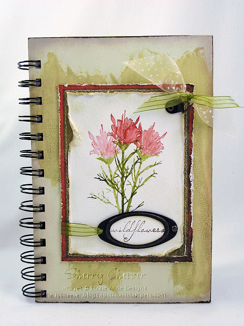
Good Saturday morning! It just dawned on me that we have another long Holiday weekend coming up – WOO HOO! I’ll be hiding in my stamp room trying to be creative! My first Stamp Club meeting of the year is next Saturday, I have new SU stamps not yet mounted and projects need to be planned. The same day the SU pre orders arrived, I also received my new Tim Holtz Anthology stamps. Which by the way, Rubbernecker Stamp Company currently has on sale!

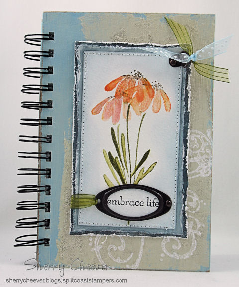
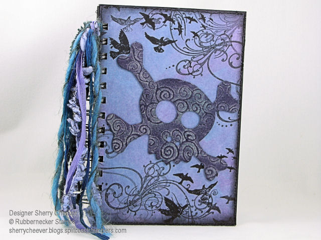
Mallory was home the day the Anthology stamps arrived and needless to say, she went nuts over them. I also have had some Grunge Board around here for the last few weeks, which Mallory had already been into. Being my typical daughter, she wanted to know if I was going to make her a new journal to take back to school. The thought had crossed my mind, but her asking me to make one was just the push I needed. We sat down, discussed what colors she would like, and I went to work last night.

I think today, the first thing I will do is show you the products used to make the journal. This might turn into a mini tutorial of sorts and I would rather you know what is being used as we go along.

Dec 29

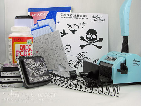
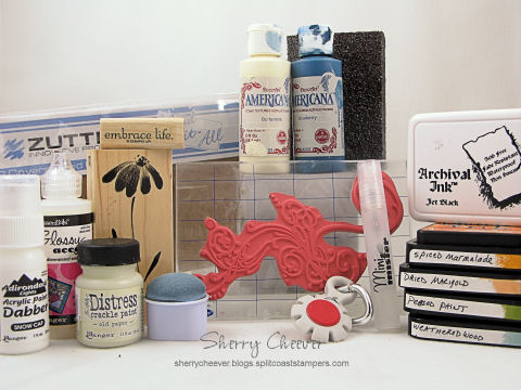
The list of what I used: Zutter Bind-it-All, 3/4″ Double OWire Binding, 7.5 x 5″ Chipboard Cover; Tim Holtz Distress Inks; Tsukineko Sponge Dauber; Tim Holtz Anthology Stamps, Tim Holtz Grunge Board Elements; White Cardstock; 6×9″ ruled writing tablet; and Mod Podge. (Most of these items you can find at My Favorite’s Page, and they also happen to be on sale.)

Anthology Journal Cover

To start, cut the white cardstock to size so that you have four pieces to cover the front and back of the chipboard covers. Using Dusty Concord, Weathered Wood and Broken China Distress Inks, work the color onto the white cardstock with a sponge dauber, and then sponged the edges with Black Soot Distress Ink. (You can find these specific techniques in my Distressing Tutorial). Once these pages have dried, stamp the main images randomly using Black Soot. To add more texture to the pages, stitching around the edges was done with black thread.

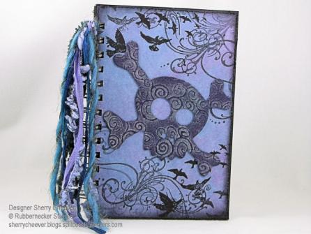
To begin preparing the journal, the edges of the cover were inked with the Black Soot Distress Ink and then sponged toward the middle of the cover. (Since this particular journal is not covered completely with designer paper, I did not want the edges of the covers to show.)

Adhere the paper to the covers using Mod Podge. A thin coat of Mod Podge was painted on the cover, the paper was placed on the cover and using a brayer, roll across the top of the paper to get out any air bubbles and to make sure that all edges of the paper are adhered. This is important when running a cover through the Bind-it-All, so that the paper around the punched holes doesn’t come loose.

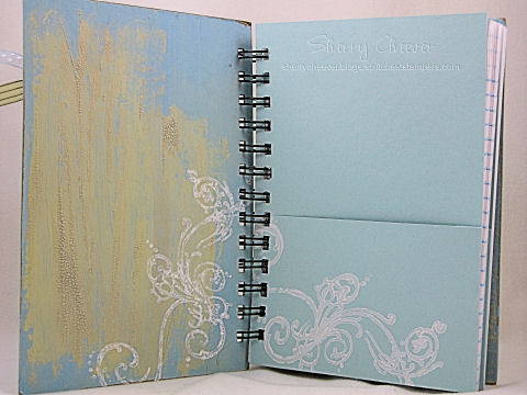
If you like lined pages in a journal, you can trim down the pages of writing tablet. These pages were trimmed down to 7-1/4″ x 4-3/4″ so that they would fit in the journal, but not come out to the edges.

We are not ready to assemble the journal. I find it easiest to work in order and assemble in order. Starting with the back cover, and using the Cover setting [C] on the Bind-it-All, line up the cover, press down in the center and then punch the first set of holes. To continue along with the line of punching, set the Bind-it-All to the Continuous setting [B], line up the next to last-punched hole in the notch, and continue punching. It is important to line up the next to last-punched hole, leaving one at the end, so that the punching will be continuous. You’ll find that if you don’t do this, you will have a gap in the holes. (How do I know this, well – I’ve done it!) At this point, I go ahead and punch the front cover and set it aside.

For the inside pages, use the Inner Pages setting [D], butt the edge of the paper up to the end, press down in the center and punch the first set of holes. Continue punching the remaining holes using the Continuous setting [B] as with the covers.

Once all the pages are punched, assemble the journal back to front as it would look when bound. Now here is the important part – flip that back cover over to the front, just as you would if it was attached with the coils. So what you have in order is, inside back cover, outside front cover, lined pages. Now thread the binding through the pages so that the square edge is on your left. To bind the journal, set the Bind-it-All to the width of the bindings. For this journal, 3/4″ since we are using 3/4″ Owires. Hold the journal by the covers and pages, placing the Owires into the binding section. Gently press the down on the handle until you feel the Owires come together.

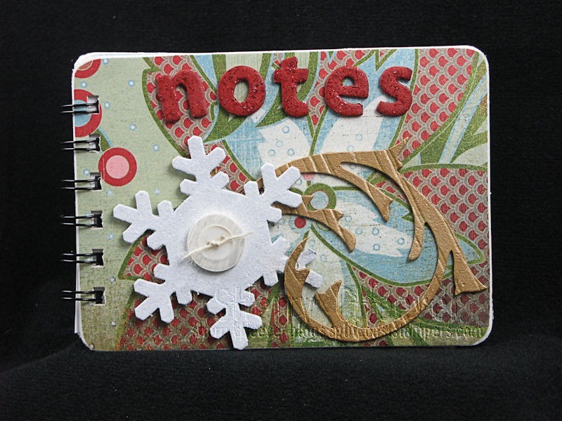
To finish the front of the journal, I picked the largest Skull and Cross-Bones from the Grunge Board and covered it with Weathered Gray Distress Ink. I worked the ink down into the grooves of the Grunge Board, and then scraped the Dusty Concord pad across the top to highlight the design in the Grunge.

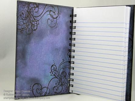
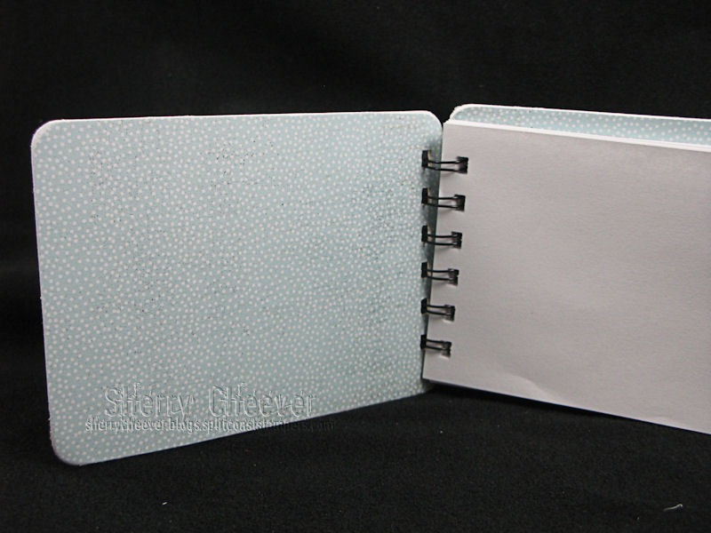
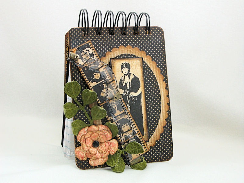
And here’s a picture of the inside of journal.

Anthology Journal Inside

© 2015 Suffusion theme by Sayontan Sinha