
Apr 192010
came together!!! Good morning!  I struggled over the weekend getting my Just For Fun® Friday Color Challenge done. Pink and blue were just not working for me and then finally late last night, it all clicked!

I think I might have been trying a technique that wasn’t working for me at the time and because I was hooked on, I didn’t want to let it ago. You’ll see more about this later in the week!
I finally pulled out my Distress Ink and water colored an image instead. A little bit of sewing, some Spellbinders™ Labels and Borders, some fun sponging and distressing . . . and this is what happened.
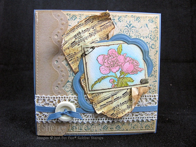
- Stamps: D3186 Rose-of-Sharon from Just For Fun® Rubber Stamps
- Paper: Cream, Tan and Blue Cardstock; Watercolor; 7Gypsies Classic Paperie; and K&Company Ancestry.com Mat Pad
- Ink: Ranger Distress Embossing, Vintage Photo, Brushed Corduroy, Antique Linen, Crushed Olive, Peeled Paint, Spun Sugar and Victorian Velvet
- Accessories: Spellbinders™ S4-130 Classic Rectangles – Small, S4-252 Big Scalloped Ovals – Small, and S4-242 Big Scalloped Borderabilities Petite; May Arts Ivory Crochet Lace and Blue Grosgrain from Stamp Simply Ribbon Store; Ranger Queen’s Gold Embossing Power; 7Gypsies paper fasteners; Button; Sewing Machine; Mounting Tape; Tim Holtz idea-ology Mini Fastener from eclectic Paperie
Thanks for stopping by today and remember . . . life is short, take advantage of all the adventures that come your way!


You nailed it! Love the image and the way you set it up! Beautiful card! I knew you had it in you…..
Gorgeous, Sherry!! I was struggling with a color combo this weekend, too. Mine was chocolate chip, creamy caramel, and not quite navy for a DT color challenge. Well…..you’re the better person for sticking with it, cuz I gave up and changed that creamy caramel to kraft since I wasn’t feelin’ the love for creamy caramel. Walked away twice and it still wasn’t happening.
Love all the pretty elements on your card. I really admire your ability to bring so many different elements onto a card front and make them work together!! Fantastic!!
Glad you hung in there as the card turned out beautifully. Edna
Great card! Lace, button, sewing and ribbon – what’s there not to love 🙂
Muy bella, as usual 🙂
Sherry,
Your patience certainly paid off!! Beautiful card. I actually like the pink and blue on it…..the two colours are definitley not my faves together. I prbably would’ve walked the frist day – LOL
Sherry –
Love this! What a wonderful card, your colors are just wonderful. The music piece just sets everything off nicely.
Elaine Allen
Beautiful result!!
Beautiful card, I love those colors. Thanks for sharing. ~Diane
Very nice Sherry. Sometimes we just have to wait for inspiration to hit. Well done.
Hugs,
Brooke
very pretty, such cool paper and borders!
Pink and Blue is WAY too SWEET (shudder) a color combo for me! I really like the way you have grounded these sweet cool colors with neutrals and warmed it up with the gold tones of the vintage music. Great job!
I’m glad you stuck to it….your creation is beautiful. You are the best with layering and texture!
It certainly did click! I love that you won’t post if you aren’t happy with it. Although I am sure most of your ‘I’m not happy with it’ cards are nicer than my ‘best of’ cards! 😀
Thanks for sharing and sticking with it! Your card is beautiful!!!!! :o)
Worth the wait
Beautiful Sherry – it was worth the wait!!!
really, really pretty. what a gorgeous idea you came up with.
Gorgeous! Just gorgeous!
So shabby-chic looking. Great composition. I’m loving it. TFS!!! Sherry. 😀
Sherry: I can’t begin to tell you how I love your artistry. I look forward to your new work. You are great!