This week has flown by so fast! I can’t believe that it’s time for another JBWW (Just Because We Wanna) Challenge. This week it’s Jeanne’s turn to pick the challenge, and she picked distressing. You can just imagine how happy I was with that one! Yep, I sure was! As with every JBWW Challenge, if you participate (which we hope you do), and post a card to your blog, please come back and link your card to either my blog or Jeanne’s, Inky Paws. If you upload to your Gallery on SCS, please use the keyword JBWW. If you’ve just stumbled across this challenge for the first time, please feel free to participate – the more the merrier!!! We love it when ya’ll play along with us.

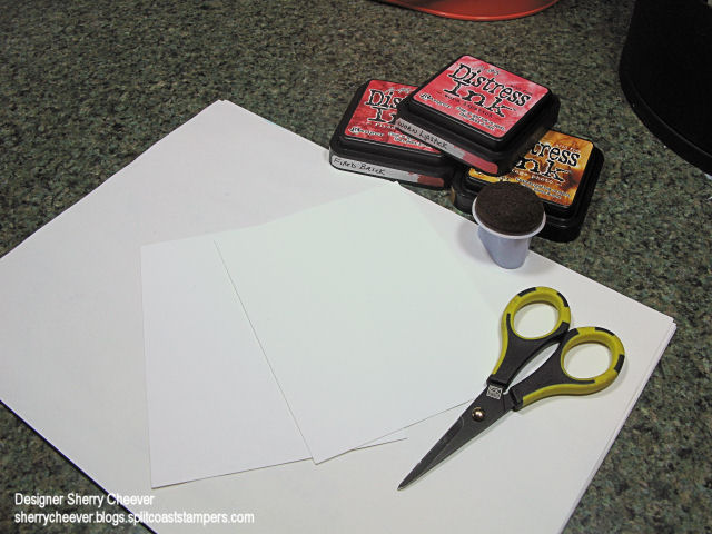
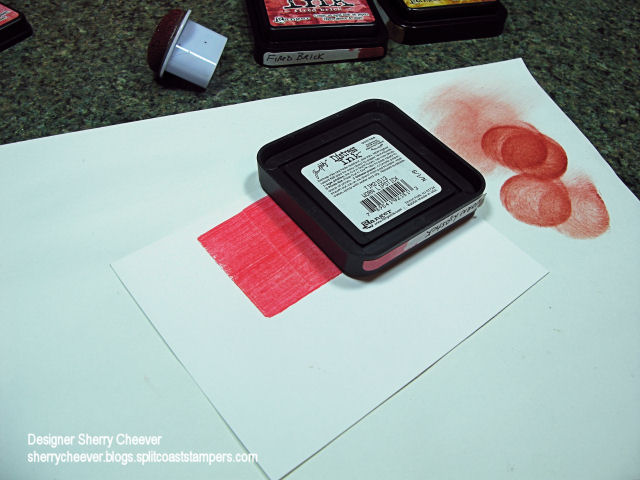
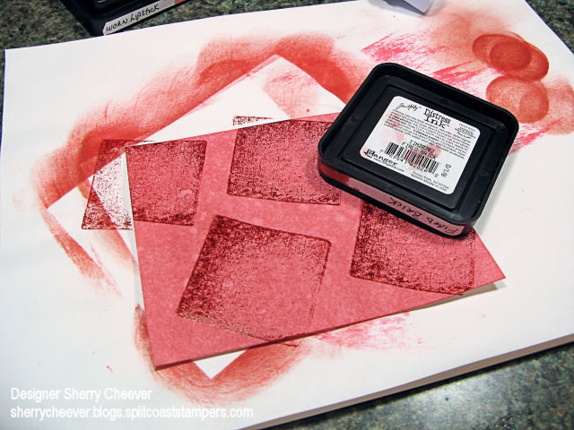
I’ve had a number of requests about distressing, and how I get those curled edges, etc. Pamm (HRSECZY on SCS) emailed me last week about this very thing. So while I was making today’s JBWW card, it occurred to me that is was an excellent opportunity to talk distressing. I’ve made a separate Distressing Tutorial, and it is the post immediately following this one.

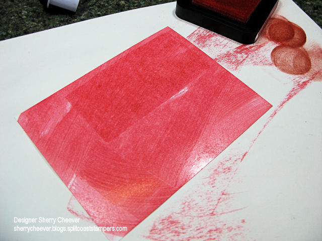
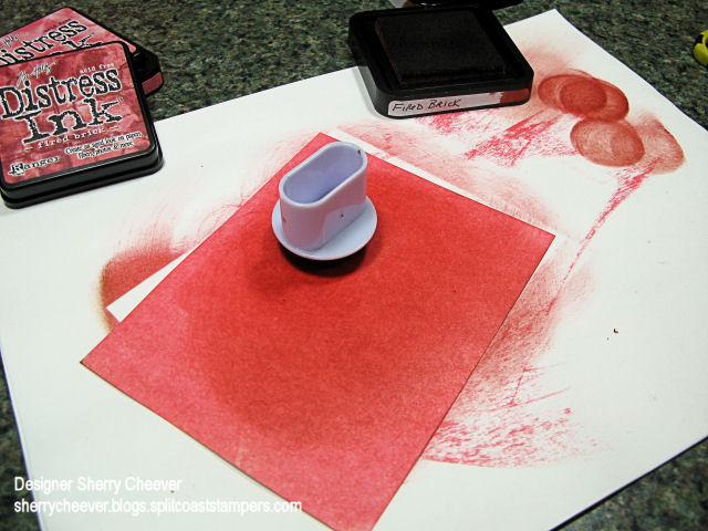
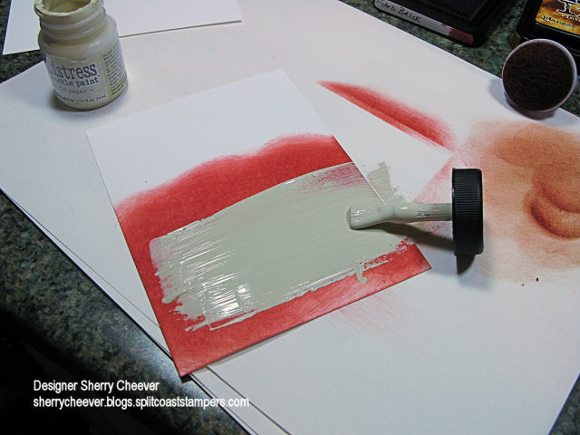
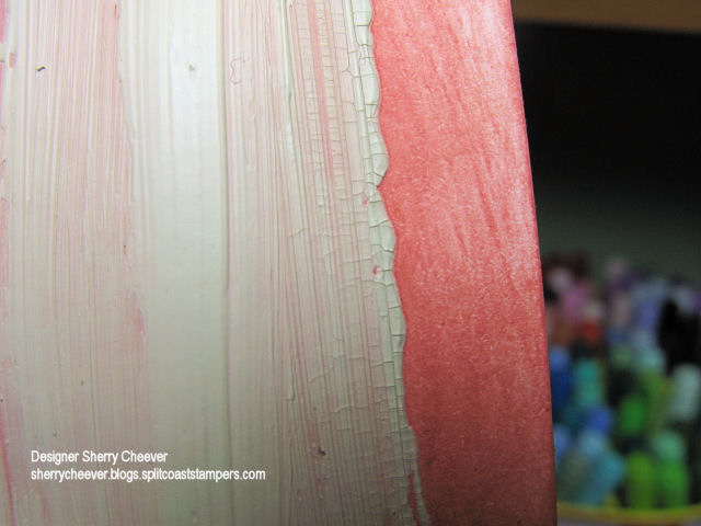
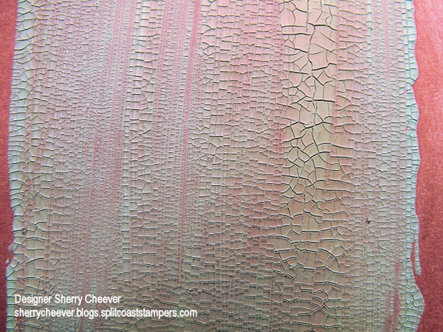
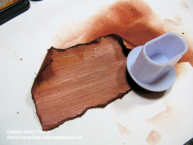
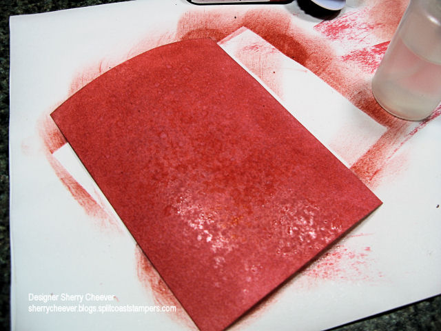
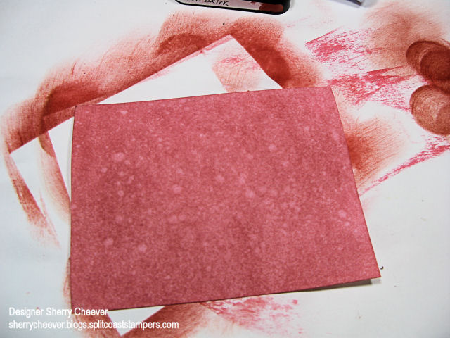
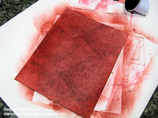
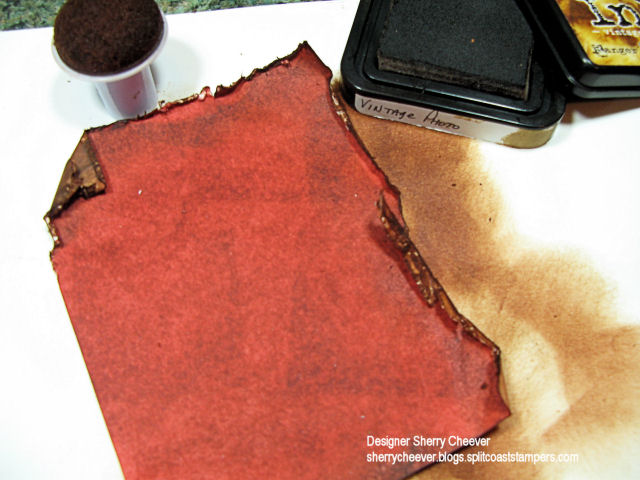
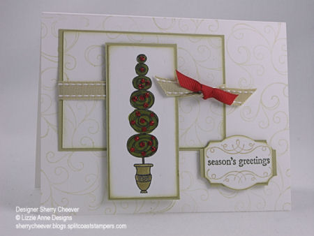
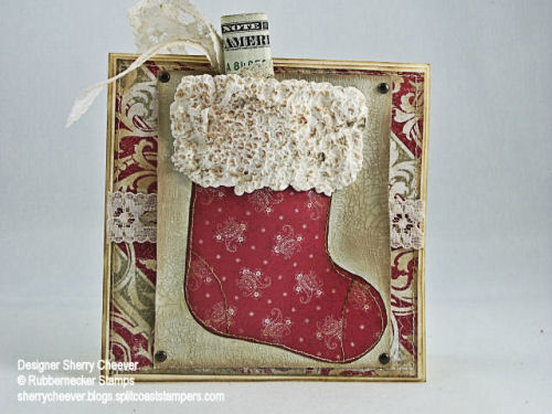
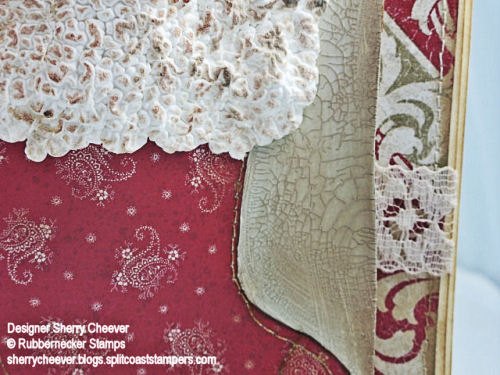
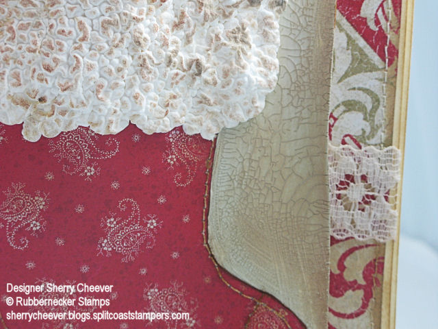
First, let’s talk about today’s JBWW card. I chose to work with a daisy image from the Bold Floral Collection from Rubbernecker Stamps today. I stamped in the image on watercolor paper then water colored using Ranger Tim Holtz Distress Inks. Once the image was dry, I trimmed it out from the paper and distressed the edges of the frame only. To add more depth to the image, I decided to sponge Vintage Photo Distress Ink along all the edges, dragging it across the front of the image. By dragging the ink across the panel, it highlighted the water coloring of the daisies. The two background panels started out as white cardstock that I sponged a combination of Worn Lipstick and Fired Brick Distress Inks on. For the background immediately behind the daisies, I used Tim Holtz Crackle Paint, tore the edges of the paper off and again sponged the edges. The bottom background panel has some added Fired Brick Paint and the edges were distressed with scissors and sponged. (More detail on all the distressing follows this post in the Distressing Tutorial).

Distress Diasy

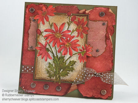
Stamps: Daisy by Rubbernecker Stamp Company

Paper: Watercolor, White and Green Cardstock

Ink: Frayed Burlap, Vintage Photo, Fired Brick, Tattered Rose, Peeled Paint, Scattered Straw, Worn Lipstick, Shabby Shutters Tim Holtz Distress ReInker; Fired Brick, Vintage Photo, Worn Lipstick and Weathered Wood Tim Holtz Distress Ink Pads

Accessories: Watercolor Brushes, Tsukineko Sponge Dauber, Brads, Ribbon, Mounting Tape, Scissors, Tim Holtz Scattered Straw Crackle Paint

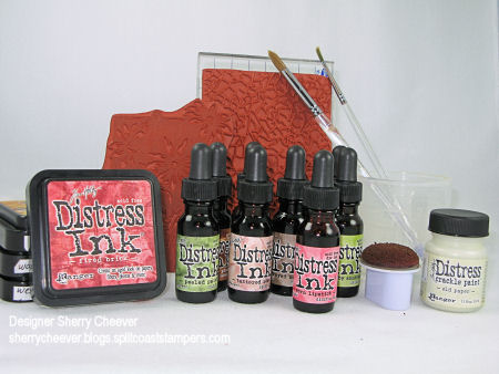
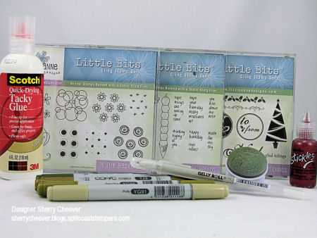
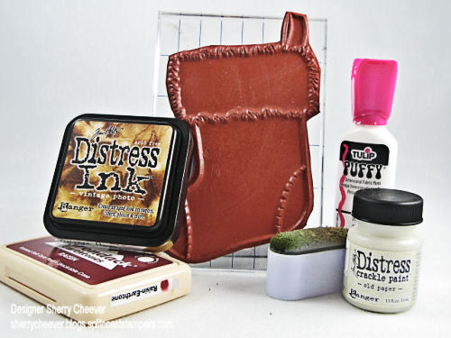
The following picture is of all the products I used to create this card, and can be found at Rubbernecker Stamp Company. I did make one mistake and included the crackle background that I decided not to use and did forget to include my ATG Gun. Sometimes ya win, sometimes ya don’t! One more thing, Rubbernecker is having their Winter Sale Event — check out all the great things on sale!

Distress Diasy Product

This tutorial will refer to different distressing techniques that I used in making a sample card.

Distress Diasy

I have worked with Tim Holtz Distress Inks throughout this tutorial because of their ability to highlight and work smoothly on the paper. With these inks, you can keep adding color on top of color without losing the hues of the colors in the layers of ink.

There are times when you want a background that fits a particular image you are working with and you have to make it. You will need to gather some white paper, a dauber and ink pads.

Distress Supplies

To start with, take ink pad to paper and run the pad across the surface of the paper completely covering the paper.

Step 1


Step 1A

To make the ink smooth and cover your paper, use a sponge dauber and in a circular motion, work the ink around the paper.

Step 1B

To add more depth to the paper, now add a darker hue of the same color on top. To do this, use your dauber and in the same circular motion, work the darker color on top of the existing color.

Step 1D

At this point, there are a few options you can add. Let’s start with crackle paint. I used Tim Holtz Scattered Straw Crackle Paint in this step on my sample card. Once you have your paper colored, paint on a layer of the Crackle Paint. The cracking achieved depends on how heavy you apply the paint. If your paint is heavy, the cracks are bigger and deeper. If you add a thin layer, there will be many smaller cracks.

Crackle Op 1

Once the paint starts to dry and the cracks begin to appear, you can speed the process up by using your heat gun.

Crackle Op 2

Once the paint is dry, it should look like this.

Crackle Op 4

The next part is the fun part. One way to distress the edges is to tear the paper along the sides and then sponge on distress inks.
Crackle Op 6

As you work the inks off the paper on, the edges will begin to curl for you if you add enough ink and work the paper enough. To make the crackles stand out more, as you work the ink onto the edges, you can drag the ink further onto the paper.

Crackle Op 8

Let’s look at making the final background layer. The first steps of applying ink to the white paper are the same. As an option, you could spritz the paper with water leaving a blotchy specked look to the paper.

Step 2A

Typically when you spritz the paper with water, the paper will curl. Never fear! Pull out your heat tool and dry the paper. As it dries, the paper will once again lay flat.

Step 2D

For my sample card, I decided to add more depth. To do this, stamp the darker ink pad randomly on the paper.

Step 3A

Then using a sponge dauber and working in a circular motion, even out the ink.

Step 3C

To distress the edges of this layer, (as in the sample card), use scissors. Scrape along the edges of the paper pulling the scissors toward you. It doesn’t matter if you accidentally cut the paper or tear it. To me, it just adds more character to the distressing.

Step 5A

When you start to sponge the edges, dragging in the ink from off the page, the edges will curl and form a shape of their own.

Step 5C

Distressing is one of my favorite techniques, and I hope you try these different styles of distressing.    All of my Favorite Products can be found here at Rubbernecker Stamp Company.

Hey it’s I can hardly believe this week is gone. My rest is over! Both girls are on winter break – the finals are done and Mallory arrived home yesterday. I’m looking forward to shopping with Mallory next week – we’ve got a few appointments scheduled and will try to sneak in some shopping while we are out and about!

I haven’t come close to completing many of the challenges on Splitcoast this week. So today I’ve decided to combine the Sketch Challenge with the Limited Supply Challenge. The Limited Supply Challenge today is to use a white-based card and the Sketch said you could drop one of the layers and that’s what I did.

SC154, LSC146

I used three different sets from Lizzie Anne Designs for today’s card. The swirl from In the Background, was stamped in SU River Rock on the white background layers. The topiary tree from High Hellos was colored with Copic Markers and then Red Stickles were used for the berries (or ornaments). The sentiment is from Glad Tiding and then punched out using the SU Designer Label Punch. River Rock was used to sponge some of the edges, and a Sakura Stardust Pen was used to highlight the urn. Simple card really, it actually took longer for the Stickles to dry than it did to make the card.

Stamps: High Hellos, In the Background and Glad Tidings from Lizzie Anne Designs

Paper: Neenah Classic Crest Solar White, SU River Rock

Ink: SU River Rock and Always Artichoke

Accessories: Copic Markers, Ranger Red Stickles, Ribbon, Sakura Stardust Pen, Tsukineko Round Sponge Dauber

I’ve also included a picture of the non-SU products used today. The stamps are from Lizzie Anne Designs. You can find the Copic Markers at Eclectic Paperie, and the remaining merchandise (glue, Stickles, dauber, etc.) can be found at Rubbernecker Stamp Company, who is having a huge Winter Sale Event.

Dec 14 Product

Hey Ya’ll! I know I’ve been missing for the last couple of days, but I’ve had a few projects to work on. In addition, I had to get some Christmas shopping done! WOO HOO almost done. Anyhoo, here’s one of the projects I’ve been working on!!

Hanna Stamps releases two new sets at midnight tonight, which is December 14th. “Things Hanna Would Say,” are 28 sayings that will fit into the word window punch, and “Perfect Package.” There are 15 separate images in the Perfect Package set, from ribbons, bows, scissors, tape to Hanna wrapping a package.

For my samples, I used the Perfect Package set on both, and colored them with Copic Markers. The background paper on both cards is from the Daisyd’s Snowflake and Holly Collection. Even though this paper as a Holiday name, I know I’ll be using some of these papers for more than Christmas – they are absolutely gorgeous!

Additional papers on this first card are Always Artichoke and Soft Sky. The corner punch was used for the photo corners and I couldn’t resist using all the brads.

PP Hanna

For the second card, I made a 4-1/4 x 4-1/4 square tent card. The additional cardstock for this card are Always Artichoke and Blue Bayou. I would never have thought these colors would go well together until I went to matching the Daisyd’s paper. I used different size Marvy Uchida punches for the topper, sponged the edges and then added Ranger Liquid Pearls in the scallops. For some added shimmer on the inner circle, I added white dots with a paint pen, and then went over them with a Sakura Shimmer pen.

PP Tent

Happy Monday ya’ll! I hope you had a great weekend and look forward to stamping fun this week! I actually finished my holiday decorating yesterday and now this place looks more like Christmas. I’ll share photos later, I know Mallory is probably interested on what I’ve done this year! There is a garland or two Mal, so don’t worry!

FYI – I’ve been asked about my distressing and sponging, again! What I’ve decided to do, is show you what I do here on my blog. I need someone here to help me with photos first, but hopefully in the next day or two I can talk my sister and/or Kate to give me a hand.

Let’s move onto today’s stamping. What a fab Try a New Technique Challenge on Splitcoast today – Paper Piecing a Gift Card. I’ve only done this technique maybe once before, so I couldn’t wait to try it again. For a gift card, the only thing I could think of today was a stocking. For years now at Christmas, by parents (now my mom), pass out little red stockings to each of us. Those little red stockings are the highlights of the year – we really love receiving what is inside! My sister has had the same stocking for years – she put her initials on it with glitter – can’t miss which one is hers.

Anyhoo, I had the perfect image to use today. The larger stocking from Rubbernecker Stamps. I stamped the image once on buff cardstock, and then on a piece of Daisyd’s Snowflakes & Holly paper. I trimmed both images out, but only the stocking part of the designer paper (which I sponged the edges of with Tim Holtz Vintage Photo Distress Ink). The DP was then sewn to the trimmed image of the buff stocking at the heel and toe. To make the gift card pocket, I traced the stocking image on another piece of buff cardstock, and then painted outside the traced area with Distress Crackle Paint. Once the crackle paint was dry and starting to crack (which I sped along the process with a heat gun), the stocking was sewn to the background layer. The stocking was sewn leaving the top open so that there was a pocket to either put in money or a gift card.

500 Stocking

This top panel was attached to another background panel of the Daisyd’s Snowflake and Holly paper. Now when I went to sew this panel, the paper buckled and wrinkled on me. But I liked it, and kept it as it was and did a bit of distress sponging. The lace is some I’ve had in a stash, and thought that it went with the feel of the card. To keep it from being bright white, I sponged some of the distress ink on it. The pocket panel is attached to the background panel with the corner brads (it leaves a little play in the card for what you might be adding inside the stocking). For the stuffing, I tied a bow around a roll of money and tied it off to hang on the outside of the pocket. This way, all you have to do is pull on the ribbon to get to the contents. Once the card was finished, I masked off the area around the top of the stocking, and applied Tulip Puffy Paint. Instead of letting it set for hours to dry, I took the heat gun and went to work. Once again, to achieve more of an aged look, I sponged on a little of the distress ink and reheated the puffy paint.

I was so taken with the look of the crackle paint along with the puffy paint, I had to take a closeup to show you.

500 crackle

Stamps: 53-09 Grand Stocking from Rubbernecker Stamp Company

Paper: Buff; Daisyd’s Snowflakes and Holly

Ink: Adirondack Raisin, Tim Holtz Vintage Photo Distress Ink

Accessories: Sewing Machine, Tulip Puffy Paint, Tim Holtz Old Paper Distress Crackle Paint, Tsukineko Oblong Sponge Dauber, Brads, Lace

Once again, I decided to post a photo of the products that I’ve used. I get so many questions, I thought this might be helpful to you. Let me know if you like this having this extra information and if it helpful to you. All products in the photo except for the Tulip Puffy Paint are available at Rubbernecker Stamp Company. The Tulip Puffy Paint I found at Meijers on clearance – WOO HOO! The Daisyd’s Snowflakes & Holly Designer Paper used today is from Jacksonbelle Embellishments.

500 supplies

© 2015 Suffusion theme by Sayontan Sinha