There’s been a challenge, a Dirty Challenge! Jami challenged the Dirty Dozen, current and alumni, to a challenge – upload a card using A Winter Song by Elzybells. We could use no patterned/designer paper (even though it might kill us in the process – she promised that if it didn’t, it would make us stronger) and to use the color, Pretty in Pink, somewhere in our design. For those of us who had not purchased the stamps, offers were made to get us images. I was lucky enough to be with Jeanne in Texas when her stamps arrived. I stamped some out before I left, so that I would have them when I got home.

The list of those Dirty Girls participating is amazing: Jami, SweetMissDaisy, kittie747, texasjdodylynn, Chantel, JanTInk, Lauraly, cookiestamper, waterchild12, StamperSharon, JulieHRR, genie1314, leigh obrien, Linda D, flaxychick, notimetostamp. 11Valerie11, mytime, rainy, debbiedesigns, Jeanne S, Duckwaddlequack, jbalcer, cwilliams, tayloredexpressions, LodiChick, atomicbutterfly, Zindorf, tashers, mel mel, WaterPixie, and rohla. Most of these girls have blogs and you will be able to find them in my blogroll. If they are not there, you can see them all on Splitcoaststampers. We’ve all used the keyword DCE1107 (Dirty Challenge Elzybells Nov ‘07).

What fun this card was to make. Some sponging, some glitter and bling, and stamping!

Dirty Dare

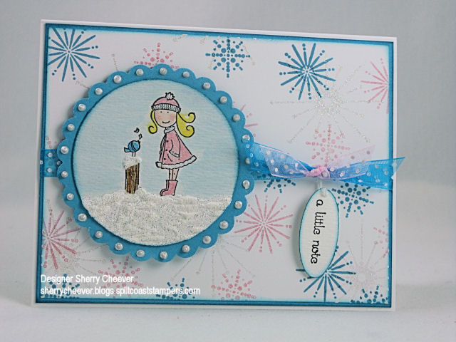
The image was stamped on watercolor paper and then colored with Adirondack reinkers. Crystal Stickles were applied to her coat and hat. The snow was made with Tulip White Puffy Paint and sprinkled with glitter while wet. The paint and glitter were allowed to dry until the very end of the card. I didn’t puff the paint until the card was completely finished so that I could manipulate the image and not flatten the poof! Liquid Pearls were applied to each scallop in the larger circle. The background panel was stamped using SU’s Snow Burst, and stamped in Pretty in Pink (there’s that pink) and Broken China Distress Ink. To add more bling to the background, the largest snowflake was stamped in Versamark and then embossed with Dazzling Diamond Dust. The edges of both the background panel and the main image were sponged with Broken China Distress Ink.

Stamps: SU Snow Burst, A Winter Song by Elzybell

Paper: Watercolor, Neenah Classic Crest Solar White, Tempting Turquoise

Ink: Pallet Noir Black, SU Pretty in Pink, Tim Holtz Broken China Distress Ink, Versamark

Accessories: Adirondack Reinkers, Watercolor Brushes, Tulip White Puffy Paint, Diamond Gold Ultra-Fine Glitter, Ranger Crystal Stickles and Liquid Pearls, Dazzling Diamond Dust EP, Ribbon, Heat Tool, Sponge Dauber

I hope everyone checks out all the other cards! WOW so much talent taking on a challenge!

Nov 202007

With Christmas just around the corner, I know that a number of you have probably asked Santa for Copic Markers. I use the Copic Ciao Markers but have very recently purchased a number of Sketch along with the airbrush system. They haven’t arrived yet, but we can still talk colors. I’ve had a number of people ask me what colors I would choose if I had to get just a starter kit of markers. Well, I can’t do that! When I got my markers, I got them all at once. What I can do, however, is give you the numbers and colors that I use the most. I highly recommend going to the Copic website and request a color sample brochure. That’s one of the first things I did. It lists all the colors the markers come in and has a symbol chart for each specific type of marker. I don’t go shopping without it!

Here’s a picture of my favorite and most used colors:

cpoic colors

and they are:

Colorless Blender
100 Black

C-1 Cool Gray No. 1
C-3 Cool Gray No. 3
C-5 Cool Gray No. 5
E00 Skin White
E11 Barely Beige
E31 Brick Beige
E33 Sand
E35 Chamois
E37 Sepia
E57 Light Walnut
E77 Maroon
Y00 Barium Yellow
Y06 Yellow
Y17 Golden Yellow
Y28 Lionet Gold
Y38 Honey
YR16 Apricot
YR68 Orange
R05 Salmon Red
R11 Pale Cherry Pink
R17 Lipstick Orange
R35 Coral
R59 Cardinal
RV10 Pale Pink
RV13 Tender Pink
R22 Light Prawn
R27 Cadmium Red
R29 Lipstick Red
R37 Carmine
R46 Strong Red
R85 Rose Red
RV23 Pure Pink
RV29 Crimson
RV34 Dark Pink
RV42 Salmon Pink
YG23 New Leaf
YG67 Moss
YG95 Pale Olive
G07 Nile Green
G14 Apple Green
G94 Grayish Olive
G99 Olive
BG01 Aqua Blue
BG10 Cool Shadow
BG12 Aqua
BG96 Bush
B00 Frost Blue
B02 Robin’s Egg Blue
B12 Ice Blue
B32 Pale Blue
B45 Smoky Blue
B93 Light Crockery Blue
B95 Light Grayish Cobalt
B97 Night Blue
BV29 Slate

Even those these are the colors that I use the most, it doesn’t necessarily mean that these are the colors you will use. My recommendation would be to get 3 shades of the same color. You will need a light, medium and dark. I use the colorless blender only to correct any little boo boo’s that I make (coloring outside a line, a drop of ink, etc.) Prismacolor has a fabulous colorless blender pen that has a fine nib on one end that allows you to get close to the stamped image and in small places. I keep both the Copic and Prismacolor on hand at all times. I also use the BG10 Cool Shadow and the C-1 Cool Gray No 1 for any highlighting I might do around the image. If I feel the highlighting is bolder than I would like, I then use the colorless blender to tone it down.

I hope you’ve all been good girls and that Santa has been watching!

Good Monday Morning! It’s Thanksgiving Week and I go pick up Daughter #2 at school tomorrow. YAHOO! I haven’t seen her since Labor Day. When she was home last, I was in Texas. Of course, she’s been calling 5 to 6 times a day the last week so I think she misses me too! She’s also had some exciting things happening: initiated into Sorority, new schedule for the next semester and has forwarded her Christmas List. Yep, gotta get that shopping list home!

I slept in today. I woke up at 6:00, moved around a bit and then went back to bed. My mother called me at 9:15 and woke me up. Guess I should quit staying up all hours of the night chatting online. By the time I feel tired and get ready for bed, then I have to read for a bit. I always have a book going and read before I fall asleep. I don’t care what time I get to bed, I’ve gotta read at least a few pages. Right now I’m reading another Fern Michaels – The Marriage Game. I have to say this one is keeping me mesmerized. I have just a few chapters left and I don’t have my next book lined up to read. I don’t like that! I normally have a couple of books sitting on the nightstand in order of what I want to read next. Guess I’ll be shopping or dig out something that I’ve tried to read and haven’t been able to yet for one reason or another. Most times, it’s because my head just isn’t in it.

Anyhoo, let’s get to today’s Splitcoast Challenge. I’ve enough I think. Today it’s the Try a New Technique Challenge and we are to make tea bag holders. I love making these little cards, but have never made one to put anything in other than a tag. I had to play along today. I don’t drink tea either, but I know I can find little packets of coffee (or make my own) to put in the holder. I just didn’t do that today.

TL143

and here’s the inside of the holder.

TLC143 inside

I used the Latte singles from Lizzie Anne Designs on my project today. The latte cup is colored with Copic Markers and the steam is highlighted with a Sakura Stardust pen. Liquid pearls were used to make the dots around the large scallop circle and a Signo white gel pen for the small dots on the pink circle. All the edges were sponged with Vintage Photo distress ink and the coffee beans were stamped using Antique Linen distress ink. To add some ribbon, I made a tie attaching the ribbon under the main image on the front, wrapping it around the back and then tying on the side in a bow. This will also help keep the tea bag holder together once something is put in the inside pocket.

Stamps: Latte Cup, Latte Saying and Coffee Beans by Lizzie Anne Designs

Paper: Georgia Pacific White, SU Pretty in Pink and Chocolate Chip

Ink: Brilliance Graphite Black, Tim Holtz Vintage Photo and Antique Linen Distress Ink

Accessories: Copic Markers, Ranger Liquid Pearls, White Signo Gel Pen, Sponge Dauber, Mounting Tape, Ribbon, Sakura Stardust Pen

Good morning ya’ll! Well it’s Sunday and that means it’s time for another JBWW Challenge. This week Jeanne picked the challenge, and luckily I had already stamped out an image and colored it, or I would still be working on the card. Here’s what Jeanne has to say: “Today’s JBWW challenge is to make a Black & White card with a splash of color. The color can be an embellishment or an image – pretty much whatever makes you happy. Make your card primarily Black & White though.”

Please make sure that you link your card here or on Jeanne’s blog, Inky Paws. If you upload to your gallery on Splitcoast, remember to use the keyword JBWW.

While in Texas, we went shopping at Stamp Salado with some friends. As we were browsing through the store, my basket getting slightly full, Anna tapped me and pointed at this stamp. She told me that it was calling my name and I just NEEDED to have it. Well, it found its way in my basket and here it is for all to see.

Santa’s Back

The image was stamped and then colored with Copic Markers. The squiggles are made with a black gel pen and then highlighted with a Sakura Stardust pen. (It’s hard to see in the photo and after six tries, I hung it up.) For the background, SU’s Holiday Print was stamped in Versamark and then embossed with Dazzling Diamond Dust. Can ya’ll tell that I’m lovin’ these tent topper cards? This one measures 4.25 x 4.25.

Stamps: Santa and Sentiment from Deadbeat Designs

Paper: Neenah Classic Crest Solar White, SU Basic Black

Ink: Brilliance Graphite Black, Versamark

Accessories: Copic Markers, Dazzling Diamond Dust EP, Brads, Ribbon, Black Gel Pen, Sakura Stardust Pen, Mounting Tape

Remember you can play the challenge throughout the week. I’ll be back next week with a JBWW Special Request.

Good Saturday morning! WOW did you guys come up with some marvelous ideas yesterday for the troops. Items I hadn’t thought of, and definitely some items that we have not had donated. I’m heading out to the store as soon as I finish this post and get some shopping done. Thanks to all who gave me ideas – YOU ROCK! (Editing to add, I got travel games — Sorry, Trouble, Dominos, Nerf Footballs, Cards, Checkers. I loved the idea of handheld games and couldn’t find them at the Dollar General, so I got the next best thing! I knew we already have books, mags and all the necessary food items and toiletries — I wanted something different and fun!)

I’m not going to take the time to babble on and on today, need to get my feet moving! While cruising the forum on Splitcoast this morning I ran across the Inspiration Challenge. This is not a challenge I do on a regular basis, but in my attempt to do more of the challenges I did check in. WOW what an inspiration piece! I was so taken with the rich colors of the tapestried jacket that I had to participate.

IC102

This is a 5×5 square card. The flower image was stamped and then colored with Copic Markers. The swirls were stamped in distress ink and all the dots, including the center of the flower, were highlighted with a Sakura Stardust Pen. The background paper is from Webster’s Pages and the yummy ribbon is from May Arts. All the edges of the image, the background papers and the panels were sponged in distress ink, The image panel and the sentiment are raised on mounting tape:

Stamps: Glad Tidings and Floral Frenzy from Lizzie Anne Designs

Paper: Neenah Classic Crest, Solar White, SU Whisper White, Old Olive and Ruby Red, Webster’s Pages Winter Wonderland Collection – Mistletoe Kisses and Starbright

Ink: Adirondack Pitch Black, Tim Holtz Peeled Paint and Old Paper Distress Ink

Accessories: Copic Markers, May Arts Ribbon, SU Hodgepodge Hardware, Scissors for distressing; Sakura Stardust Pen, Sponge Dauber, Large Oval Punch, Mounting Tape

© 2015 Suffusion theme by Sayontan Sinha