Well I just HAVE to share what I got in the mail today! This was just such a fabulous surprise and I am so impressed! Anna a/k/a Siberian Stamper on SCS has been the sweetest person. Always leaving nice comments and offering such fab support (actually she’s been following my work for a long time — and I so appreciate it)! So today I go to the mailbox and look what Anna has sent me! WOW even the envelopes are a work of art!

SMAK Anna

Anna thank you so much for thinking of me and you can SMAK me anytime!

Well, first things first! I have decided that I like the name “Tawdry Treats.” I can’t help myself – I sit here thinking about it and Tawdry Treats is the first thing that pops into my head. So Florence, if you will email me with your address, the RIW card is yours. The rest of you stay tuned, in a few days (actually once I get out of this house for something other than tennis or grad stuff), there will be some Tawdry Treats!

For today’s Splitcoast challenge, Ways to Use It. I have literally worked all day on this one little bitty card – well not all day. My new light tent and lights came so I had to sit it up first! And, Mr. Brown came last night with a mega workshop order that had to be sorted (can you guess who had the most stuff). Anyhoo, the object of today’s challenge is to use little stamps and I was just determined to use Baby Basics from paper salon. Why do you ask? Because there was a baby in stalkerville yesterday. My coaster supplier, StampinSilvia had a little girl!!!

So I stamped the elephant in pink with little red hearts, added a few accents (which I’m not sure about but I wanted to play up the red hearts) and raised it on mounting tape on a large scalloped punch. Doodles a few white dots too! It’s a Girl was stamped on Whisper White (which came in the workshop order), and then the little cloud from the set was stamped in versamark and embossed with Dazzling Diamond Dust. Don’t know what else to say about the card, except for a small simple card, it has driven me nuts!

It’s a Girl

Stamps: Baby Basics by Paper Salon Tailored Tins

Ink: Pretty in Pink, Real Red, Versamark

Paper: Whisper White, Pretty in Pink

Accessories: Ribbon, Signo White Gel Pen, Mounting Tape, Dazzling Diamonds

I always love the morning after the DD Gallery opens. I don’t feel stressed and worried about getting my projects done and upload. It’s always a great day for me to unwind and to do a little fun stamping. Today is no different!

I checked this morning on the Sketch Challenge on Splitcoast (we all know it’s my favorite of the week), and wow what a sketch. If you haven’t checked it out, follow the link above – you won’t be sorry.

I spent the afternoon yesterday cleaning out my retired SU stamp sets, putting away those I never used in a box and keeping those well-loved ones close by (just on a different shelf). Much to my dismay, I have 12 sets that have not retired and none of them I like to stamp with. To make matters worse, I’ve got myself involved in another Twisted and Demented Swap, and only one of these sets actually has any possibilities. I think I might be in deep doo. So for today’s card, I went to some of my unmounted sets.

While I was brainstorming this card, I knew that I wanted to use some of my new Crate Paper (which I got from Jackonsonbelle Embellishments and the polka dot paper from the Samantha Collection was absolutely calling my name. Of course, the perfect stamp for this paper (in my own opinion) is You Take the Cake from My Favorite Things. I stamped the image in Black Stazon, and then colored it using Prismacolor Pencils and Turpenoid. I tried to match her dress to the Poppy paper and then the background and cake to the Tulip paper (which I chose to work with as my background). The sentiment is stamped in Black Stazon on a scrap of the DP. While making the measurements for the layout of the sketch, I knew immediately that to dress it up a little, some sewing must be done. So, I sewed all the DP panels onto appropriately sized panels of SU Real Red. The image panel is raised on double layers of mounting tape in order to get the height to go over the side panels. (Already, I’m looking at this sketch imagining many possibilities to alter it – oh MY!) By the way, the card measures 5 ½” x 5 ½”.

You Take the Cake!

Stamps: You Take the Cake by My Favorite Things

Ink: Black Stazon

Paper: Whisper White, Real Red, Samantha Collection by Crate Paper

Accessories: Ribbon, Brads, Mounting Tape, Sewing Machine

Yesterday, I asked you to help me come up with an alternative to the name Blog Candy.  I’ve had a number of suggestions and honestly I’m having a hard time deciding.  These are my favorites to date and I LOVE them all:

Devilish Delights

Wicked Winnings

Naughty Nuggets

Bad Baubles

Twisted Truffles

Tawdry Treats

You gals ROCK!  I could never have come up with these on my own and now the trouble begins with having to decide!

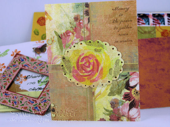
Today I bid a farewell to my most loved and most used stamp sets – Roses in Winter and Petal Prints. My RIW are the most gnarly and nasty looking stamps you have ever seen. The wood is completely discolored, the rubber is coming off of some of the small stamps – glued back together with tender loving care. The Rubber Lovers, my stamp club, actually made fun of me last week about the condition of these stamps. They have been well loved and well used. I’m going to put these sets away now – and hope to find something to take their place. You’ll see them again – eventually! I know that I will use them again – sometimes certain colors just cry out for RIW. Petal Prints doesn’t look nearly as bad as RIW, but they were inspiration for a series of cards that I did some time ago. One day I’ll upload them all hear for you to see. It is also a favorite set that I like to combine with RIW.

Last week when The Rubber Lovers met, they wanted to learn the technique of stamping on wet watercolor paper. It is one of my favorite techniques, so I was quite eager to show them. There are so many ways to maneuver the colors around, make them bright or dull, let them run together or have them stay put.

The first thing you need to do, is to completely saturate your watercolor paper with water. I use a mister bottle and just spray until the water literally runs off. I let it set up for a few minutes, allowing the water to soak into the paper and then I start stamping. You really need a solid image stamp for this (RIW being one I’ve used for many projects). If your paper gets dry, give it a light mist and continue stamping. For an all over blending effect, once you are done stamping, you could re-mist the paper and watch the colors run. IF you want to tone down the colors, after you have misted your final stamping, you can take a piece of paper towel and lightly dab to remove some color. This is what I have done on today’s card. But, I couldn’t stop there. I also combined the cracked glass technique to give an overall aged look.

Now for today’s card. I actually started this card for today’s Color Challenge on SCS. When I saw the colors of Rose Red and Apricot Appeal my brain clicked into overdrive and all I could see were roses. I knew that this was probably going to be one of my last cards with this set, so I really wouldn’t to try and experiment with a number of techniques with it. Plus, I’m out of Whisper White cardstock!

I misted my watercolor paper, inked the Roses in Apricot Appeal and rock and rolled them in Rose Red. The fern like stamp from Petal Prints was stamped in Tempting Turquoise, the leave in Green Galore and the small flower in the different colors. I misted the image again to let the colors blend a little and dabbed a paper towel in certain areas where I wanted to remove some color. While the paper was still a little damp, I stamped French Script in Ranger Walnut Distress Ink (after stamping off 4 times before). I sponged the edges of the image in the distress ink and then once the image was completely dry, I stamped the sentiment in the distress ink. I liked what I had, but wanted to add just one more touch. I inked up the image with Versamark and embossed 3 coats of UTEE. Once the image had been placed in the freezer and cracked, instead of just sponging across with the distress ink, I took my stamp pad and pressed and pulled across the image. I was amazed (doesn’t take much sometimes) to see how well the ink went down into the cracks. I then figured out where I wanted the ribbon and brads, and mounted the image on Rose Red cardstock. To tone down the layer, I sponged just a smidgen of distress ink on the edges. The layers are then mounted on a Rose Red card.

Fond Farewell

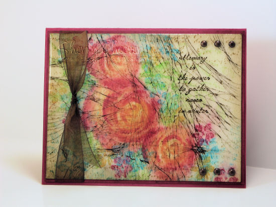
Stamps: Roses in Winter, Petal Prints, French Script

Ink: Rose Red, Apricot Appeal, Green Galore, Tempting Turquoise, Ranger Walnut Distress Ink

Paper: Watercolor, Rose Red

Accessories: UTEE, Misting Bottle, Wedge Sponge, Brads, Ribbon

AND, I just decided this! I have been wanting to offer up some blog candy, but the term blog candy is not that appealing to me. I’ve been wrestling with a new term for weeks now and really haven’t hit upon anything that I like. Bear in mind, that I have been trying to incorporate it with *BAD*. How can Bad Sherry offer up blog candy that is not *Bad*? So here’s my offer: anyone leaving a comment on this post with an alternative choice for blog candy (for this blog only), will have an opportunity to win this card! It must go along with the theme of the blog – bad, wild, etc., you get the idea. I will pick my favorite alternative and that lucky person will receive this card!

© 2015 Suffusion theme by Sayontan Sinha